Is that really the best image for your landing page? These 12 illustration examples show you how it's done.
Is that really the best image for your landing page? These 12 illustration examples show you how it's done.

Ever heard of the signal-to-noise ratio?
It gets a bit technical, so I’ll cut to the chase.
In electronics, specifically radio, the signal-to-noise ratio represents how clean and clear a signal is versus the amount of background noise present in the sound.
How does this apply to digital marketing and landing pages, you ask?
It’s simple: your landing page is your only chance to convert a customer. First impressions last. Everything on your landing page influences that purchasing decision, but I want to zero in on one specific element here that I often see done so badly: images.
The image you choose for your landing page can make or break it.
So, let’s look at how to cut the noise, boost the signal, and supercharge your conversion rate.
Why are landing page images so important?
How many times have you seen the same stock photos or canned illustrations on website landing pages?
I’ve roasted hundreds of landing pages, and I can tell you that my answer is: too many to count.
A lot of attention is paid to the copy on a landing page, and that makes sense. But images carry so much more weight than you’d think, too.
Humans are naturally visual, and often the images or illustrations that you choose for your site will be the key, if not only thing that your visitors use to judge your product.
Visual communication counts. And so many landing pages I see are getting it wrong.
But how do you pick out landing page images that aren’t generic, irrelevant, or just plain suck?
Glad you asked.
What not to do when choosing an image for your landing page
We’ll get into some specific examples of landing page images that work shortly.
But first, let’s think about what not to do.
Here are the big mistakes I see a lot of websites making with landing page images:
- Using screenshots of the product. It’s logical to use real screenshots, but it can quickly make a landing page look busy, cluttered and low quality.
- Relying on generic stock imagery. That nice lady smiling in a headset is a lovely image, but it tells me zilch about your business. I’ve seen it a thousand times before and it’s… well, naff. Just don’t do it.
- Failing to convey your USP. Even custom images can sometimes fall short if they don’t showcase what’s unique about your product at a glance. Remember, visual communication is key.
12 really great examples of landing page illustrations to show you how it’s done
Okay, that’s the theory out of the way. Let’s get stuck into the helpful bit.
Here are 12 practical examples of landing page illustrations and a few words about why I think they work so well.
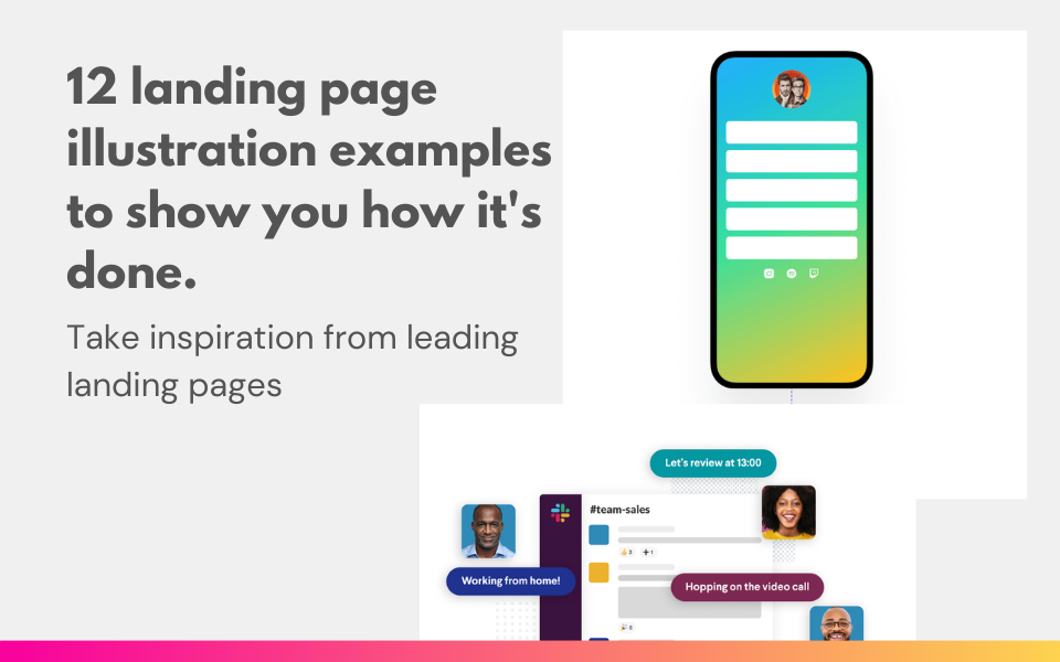
1) Clean, clear, and concise
This animated image on the Encharge.io landing page shows me what the app can do and even highlights key integrations. It’s the ideal balance of features and benefits; using graphic elements to signify connectivity, and screenshots to show the experience.
2) Keep it simple, stupid
As we just saw, the best landing page images will blend the experience of the product with the visual design — and this example from Slack nails it, too. In a single glance, you understand that this is an app which helps people communicate remotely. Simple.
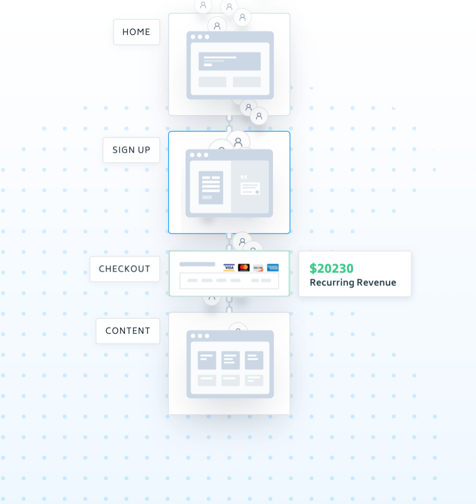
3) Break down complexity
Some products are complex by design. That’s not something you want to shy away from, but it also might result in a lot of visual clutter. Here’s an elegant solution: use wireframes of key areas of your product to highlight valuable user flows. Even better, visitors to the Memberstack website can control the landing page animation to really experience their product first-hand.
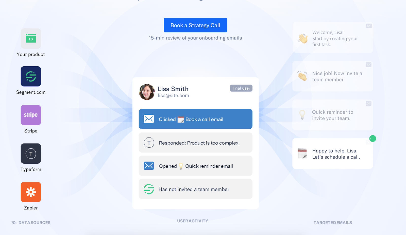
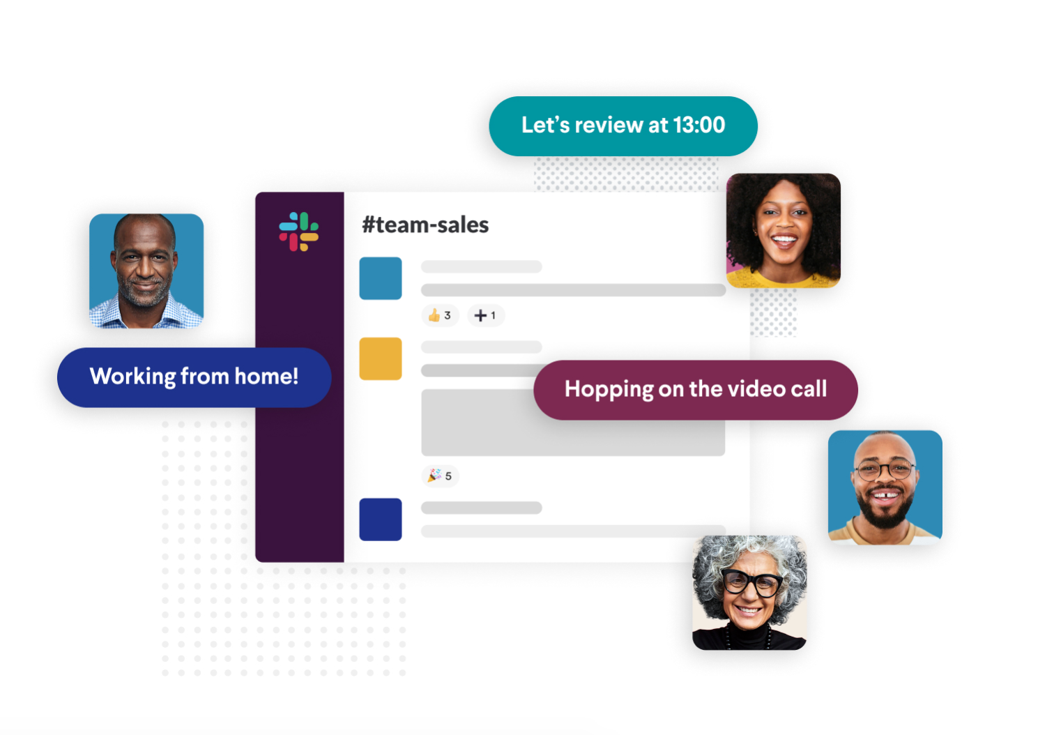
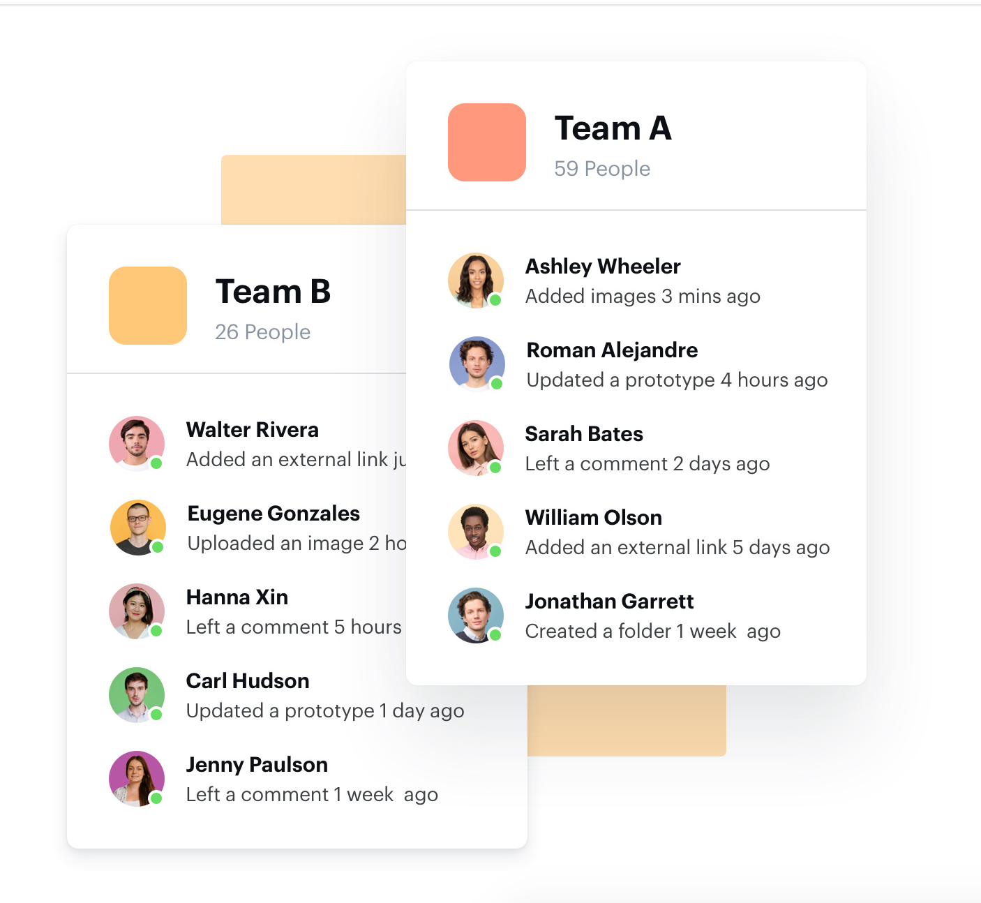
4) Demonstrate clear benefits
Good wireframe illustrations visualise your product. Great wireframe illustrations convey the benefit, too. Take this example: in a single glance, you understand that this tool brings teams together in a collaborative environment. The use of profile pictures and names makes it feel real, as well. I can imagine this tool solving critical problems in a workplace, which, ultimately, is what the site is trying to demonstrate.
5) Illustrate the user experience
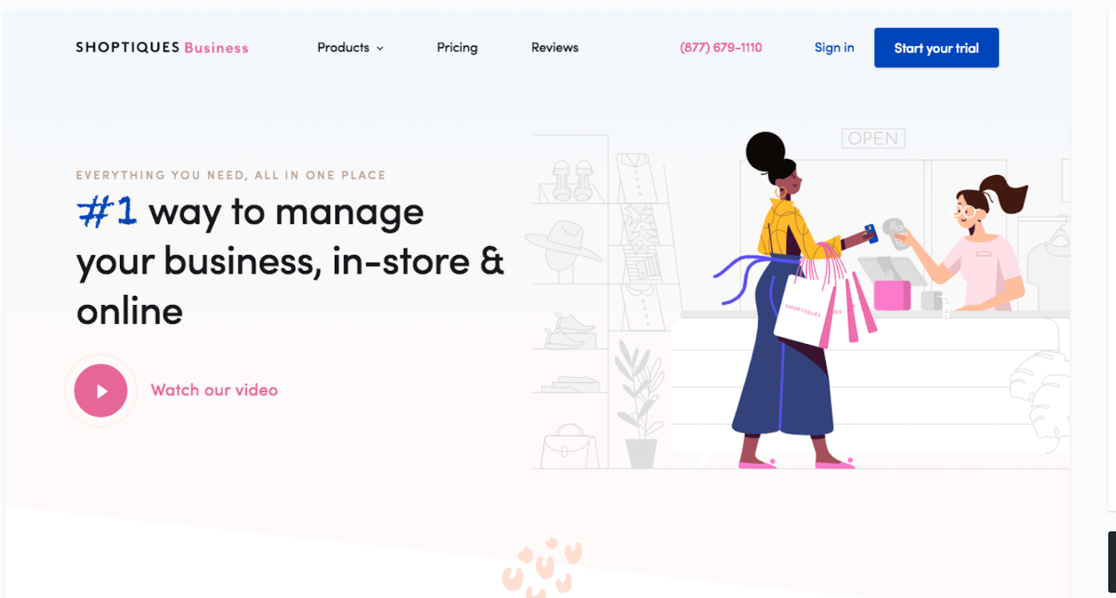
Illustrations don’t always have to be UI mock-ups. In many cases, an illustrated hero image portraying the experiential side of the product can be just as powerful (if not more!). Take this example, from Shoptiques. Immediately I get that this is a retail-oriented ecommerce product. It’s bringing in-person retail experiences online. I don’t need a single line of text. Nice.
6) Your USP. Crystallised.
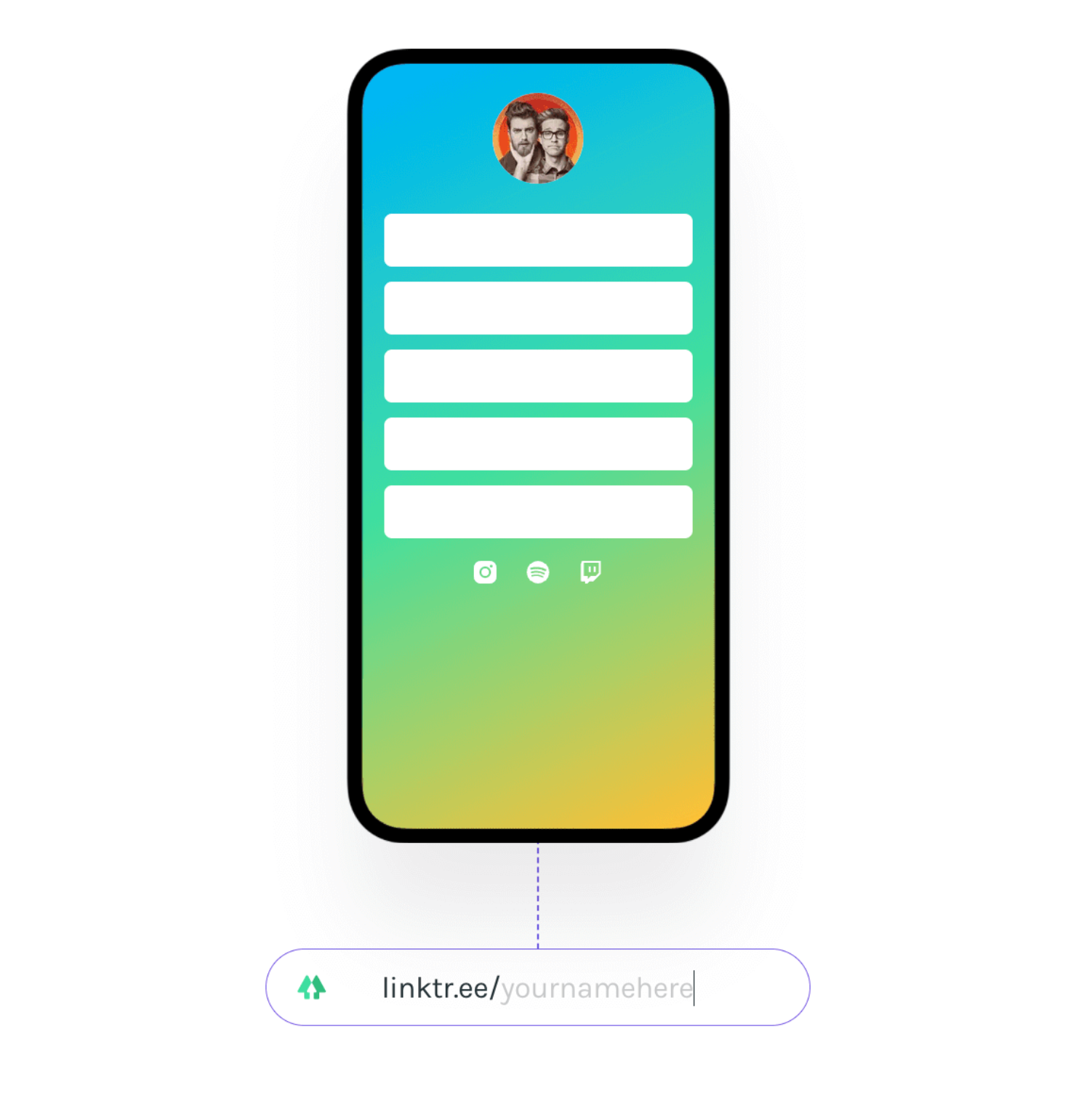
This won’t work for all products, but if you’re able to show your unique selling point in a single illustration, it can be a huge asset. Elevator pitches are one thing, but to do it in a single image like Linktree? That’s impressive.
7) Showcase lots of features at once
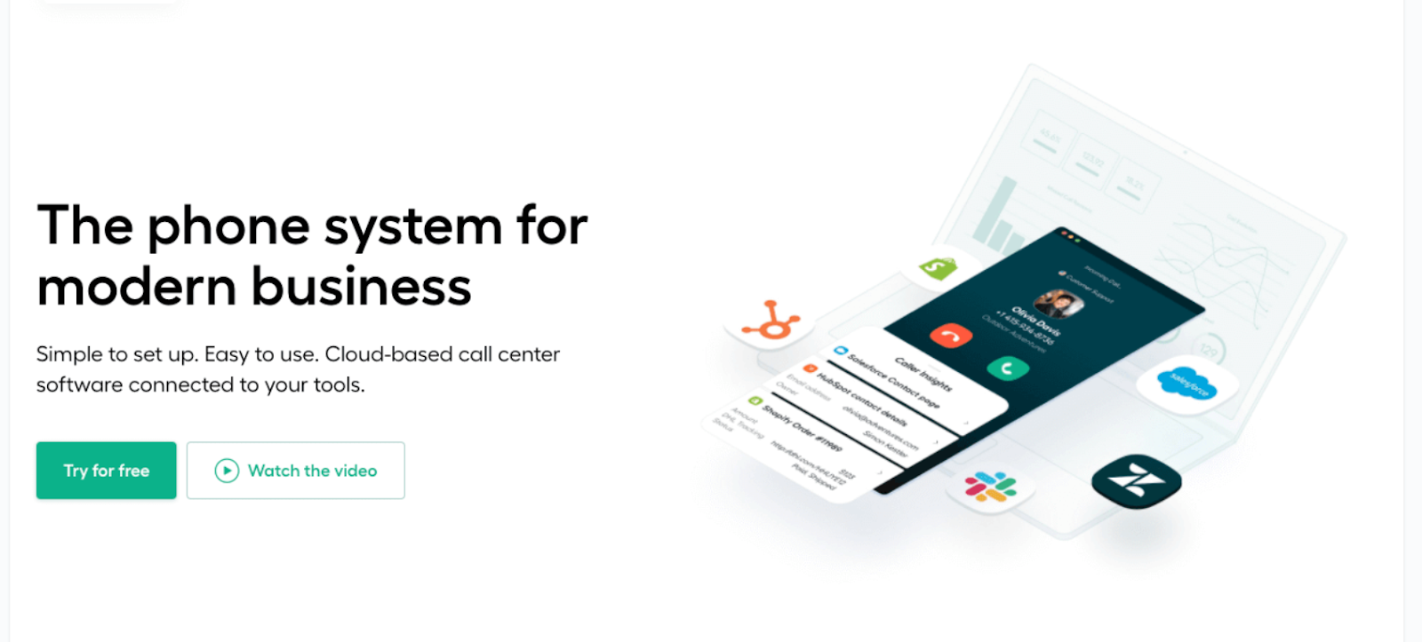
Sometimes a simple illustration is all it takes to convey what your product can do. Other times, you need to pack in a bit more detail to really bring your product’s potential to life. Here’s an example that does so, without making the end result overly complicated. In this image from aircall, you can see the app itself, the integrations, and an analytics suite. Seems pretty powerful — I’m likely to read about the product in more detail to understand the full scope of what it can do.
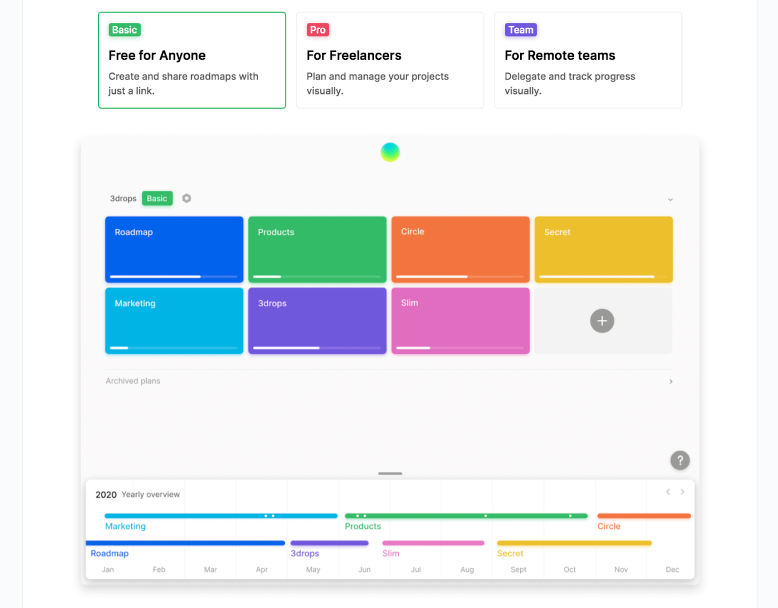
8) Let the product speak for itself
Ok so here’s where I contradict myself. In the ‘what not to do’ section, I said not to use product screenshots. But if your product is simple enough that you can create a mockup that does the talking for you — that might be all you need. In Roadmap’s case, the mockup very clearly communicates exactly what this product is and how it works. No need to create anything new or fancy. Just let the product speak for itself.
A word of caution here though: only do this if your mockup is simple enough to clearly convey what your product is and how it works. Don’t confuse your visitors before they’ve even got started.
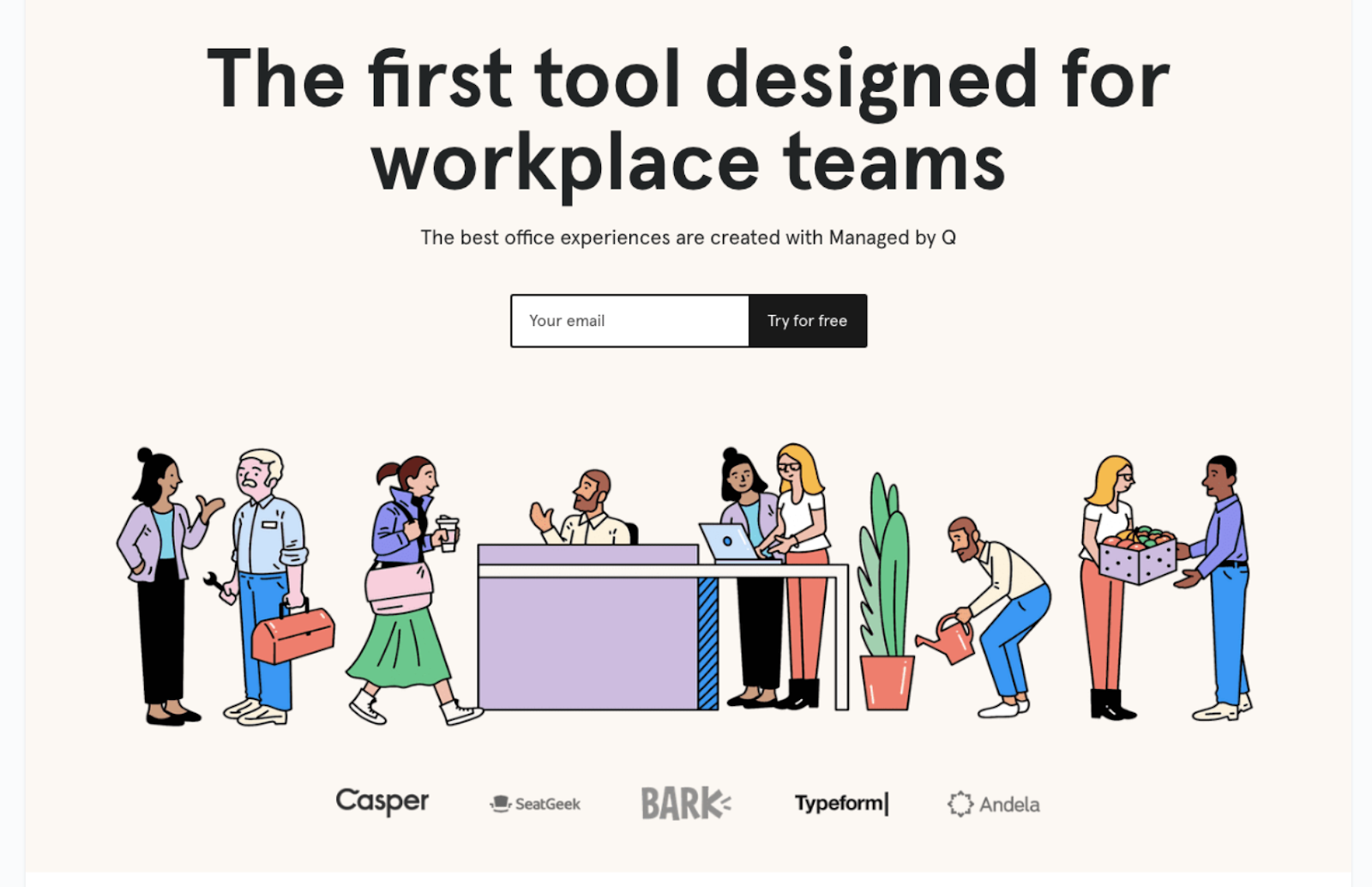
9) Make it human
Isometric illustrations of people are now so overdone (hello every SaaS website since 2016…), but that doesn’t mean you can’t bring a bit of life into your illustrations without becoming cliché.
Eden uses clean, colourful, human-centric illustrations of busy people getting s**t done to communicate the variety of people their product serves. It’s a ‘cuter’ style of illustrations, but it’s warm, approachable and reflects a lot about the brand itself.
Remember: your audience needs to imagine themselves in your product. Human-centric illustrations can help you achieve this.
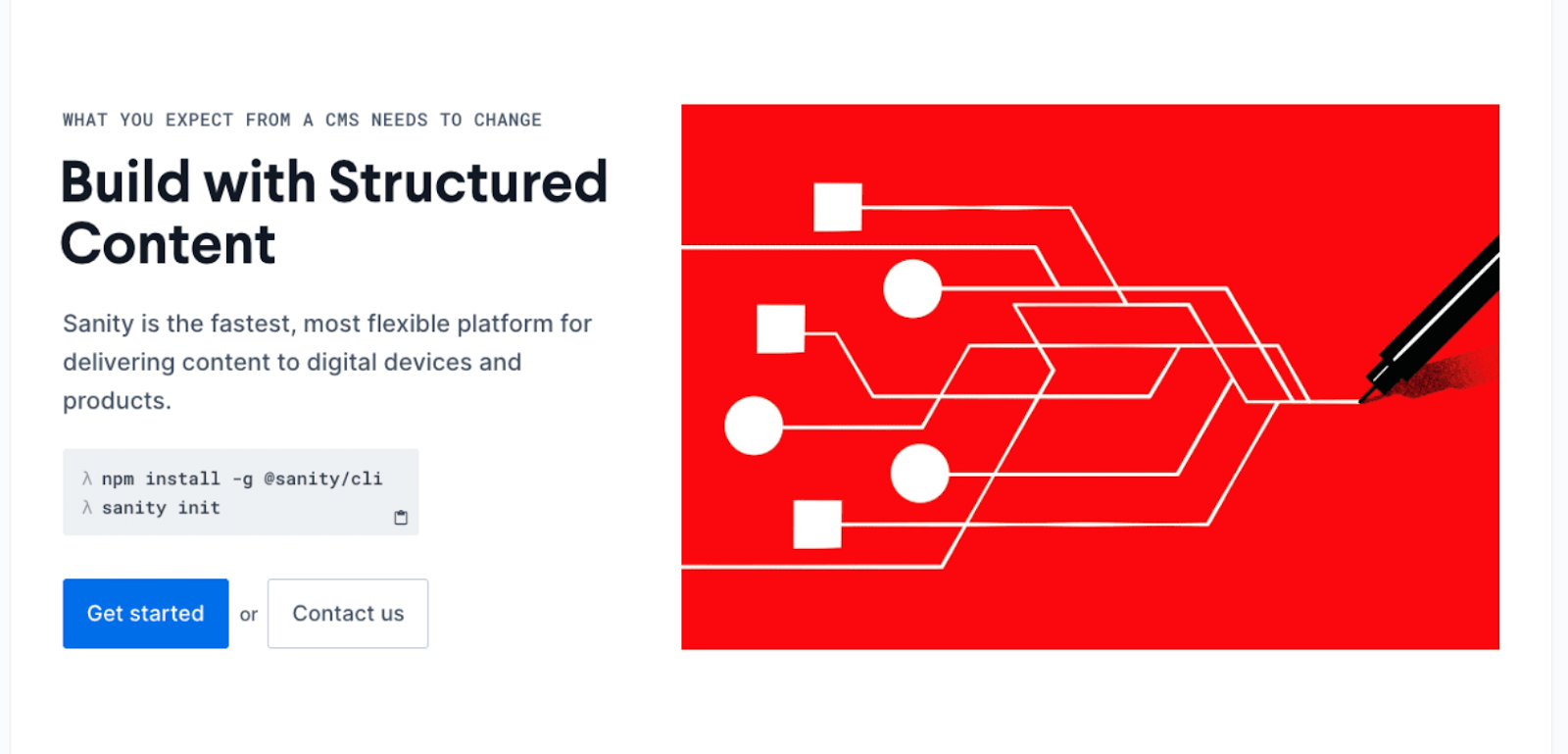
10) Take a diagrammatic approach
Ever heard the phrase ‘a picture’s worth a thousand words’? Of course you have. Here’s that concept in action. From this simple diagram, content delivery platform, Sanity’s, core USP is easy to understand. Take many items, structure them, and deliver a single output.
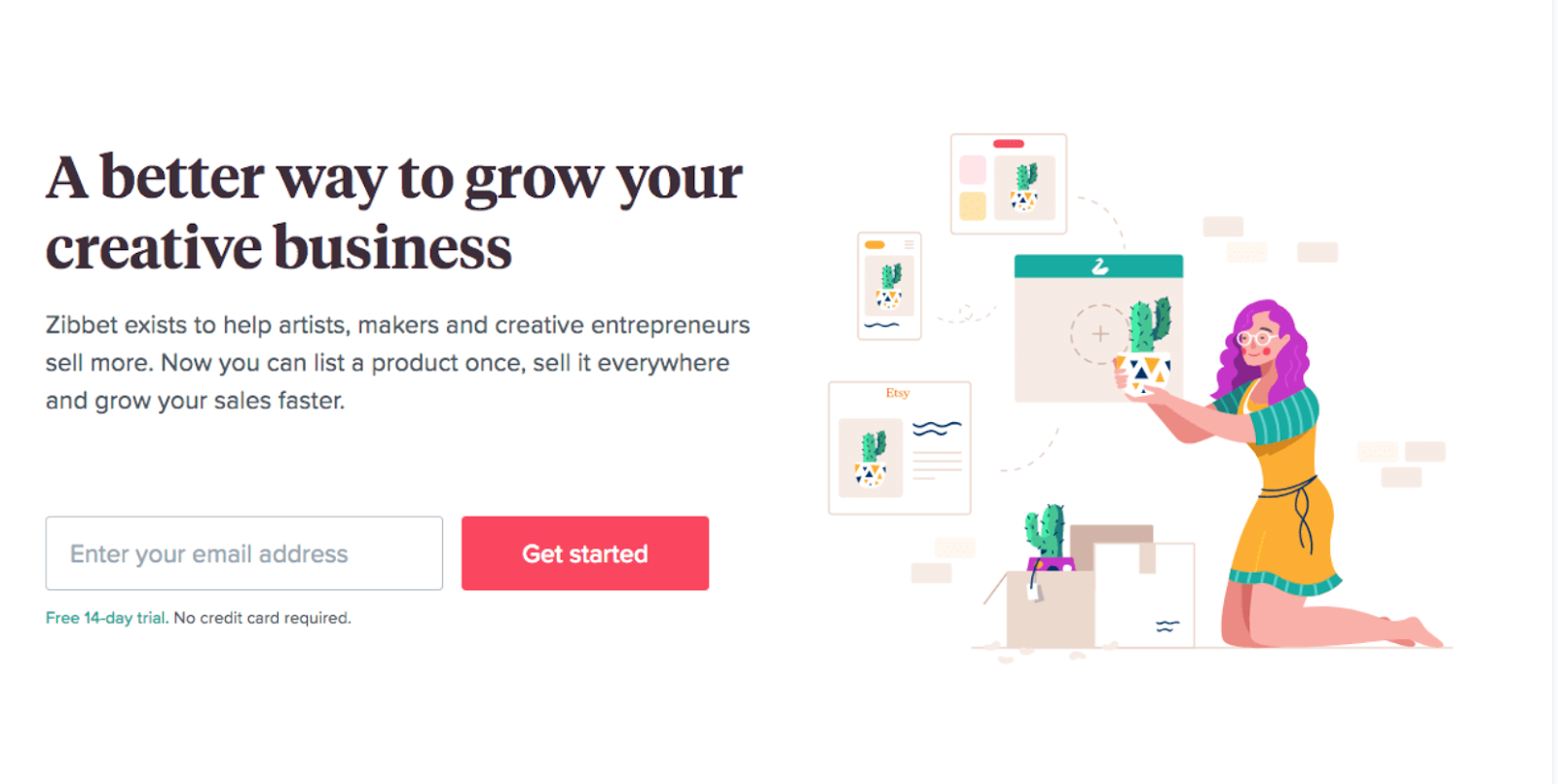
11) Illustrations, meet mock-ups
So far, we’ve seen several examples of UI mock-ups, and several others of pure illustrations. As the saying goes, why not both? Zibbet’s landing page is a great example of that approach in action. I really like this style as it allows you to add a layer of detail into your illustrations without going too in depth. In this example, we can see a number of different product page use cases, and how an independent retailer is able to add her creations to them with ease. It tells a strong story, but it’s mega simple. I like.
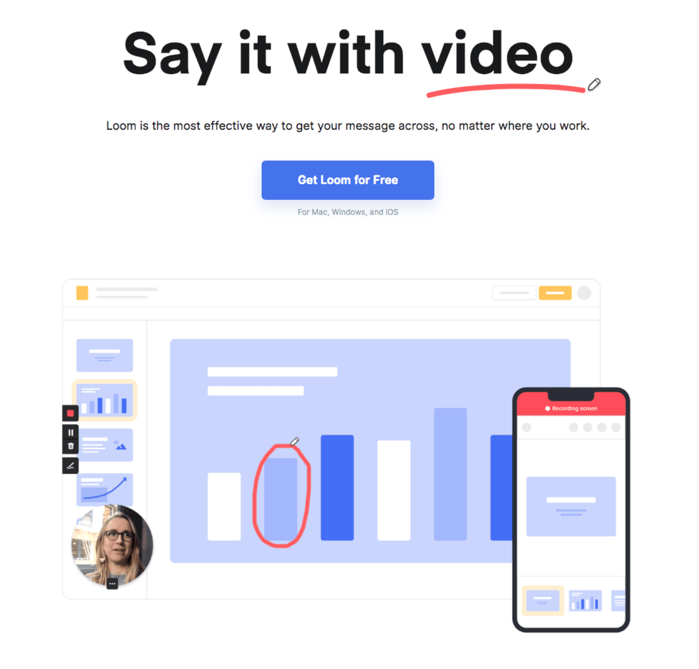
12) The pure-play UI illustration
This last example is prime landing page material for any SaaS product. Not only does it simplify the UI, it does so while still saying a lot. I’m seeing three of Loom’s core features at play here: video recording, real time annotations, and a mobile app. Which is pretty impressive given how basic the mockup is.
Not sure if your landing page image is doing more harm than good? It’s time to get roasted.
We both know that you could spend hours (if not days) trawling the web for advice about how to endlessly tweak your landing page to maximise conversion rate.
But, honestly, it’s a minefield, and you’re likely too close to your product now to see what’s working and what’s not.
If you’d prefer some straight-shooting, no-holds-barred, actionable advice from someone who’s reviewed more landing pages than had hot dinners — I’m your guy.
Get in touch today and I’ll roast your landing page for just £149.
All signal, no noise. Guaranteed.