You need to show your visitors life *before* and *after* your product. Here's 5 examples

Rather than highlighting different elements on a single landing page, I am going to show you one common element across multiple leading SaaS landing pages.
This is a proven element that you can add to your landing page to turn more of your visitors into customers, and improve your marketing ROI.
It's called: Before and After.
Read on to see it in action on the Outseta, Fathom, Popwork, Basecamp and Growth Mentor landing pages.
🧐 What is Before And After?
Paint a vivid picture of life with and without your tool or product. Paint it with words, metrics or visuals.
Find a simple way to articulate it on your page and you'll drive more people into the sign up flow.
Example 1: Outseta
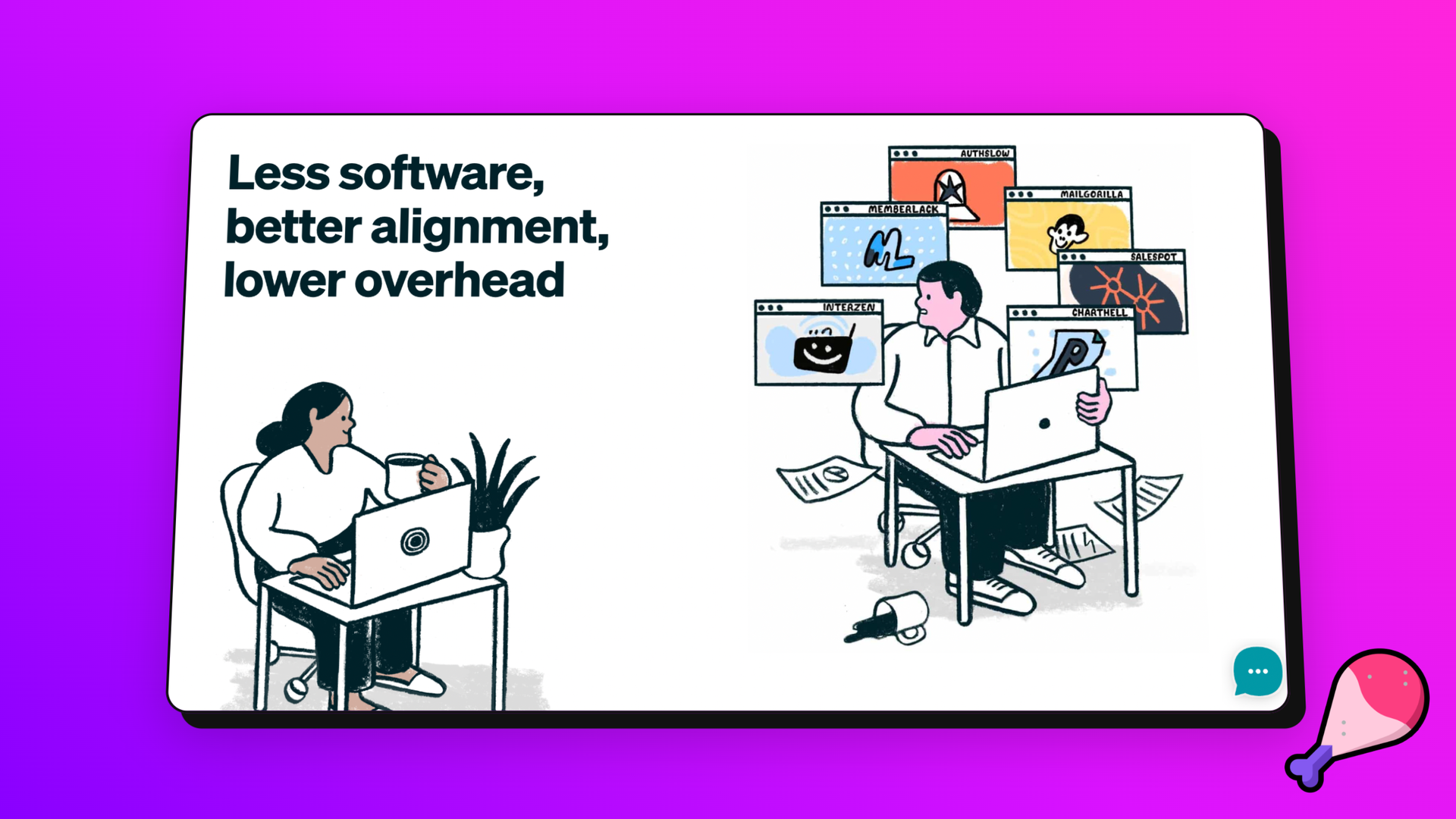
Here's how Outseta achieves Before And After with a great illustration.
- Person A: stressed, coffee spilt, overwhelmed with software
- Person B: chill, got a plant, at peace, using Outseta.
Visitors can infer that with Outseta they will have the peaceful life of Person B.
Example 2: Fathom
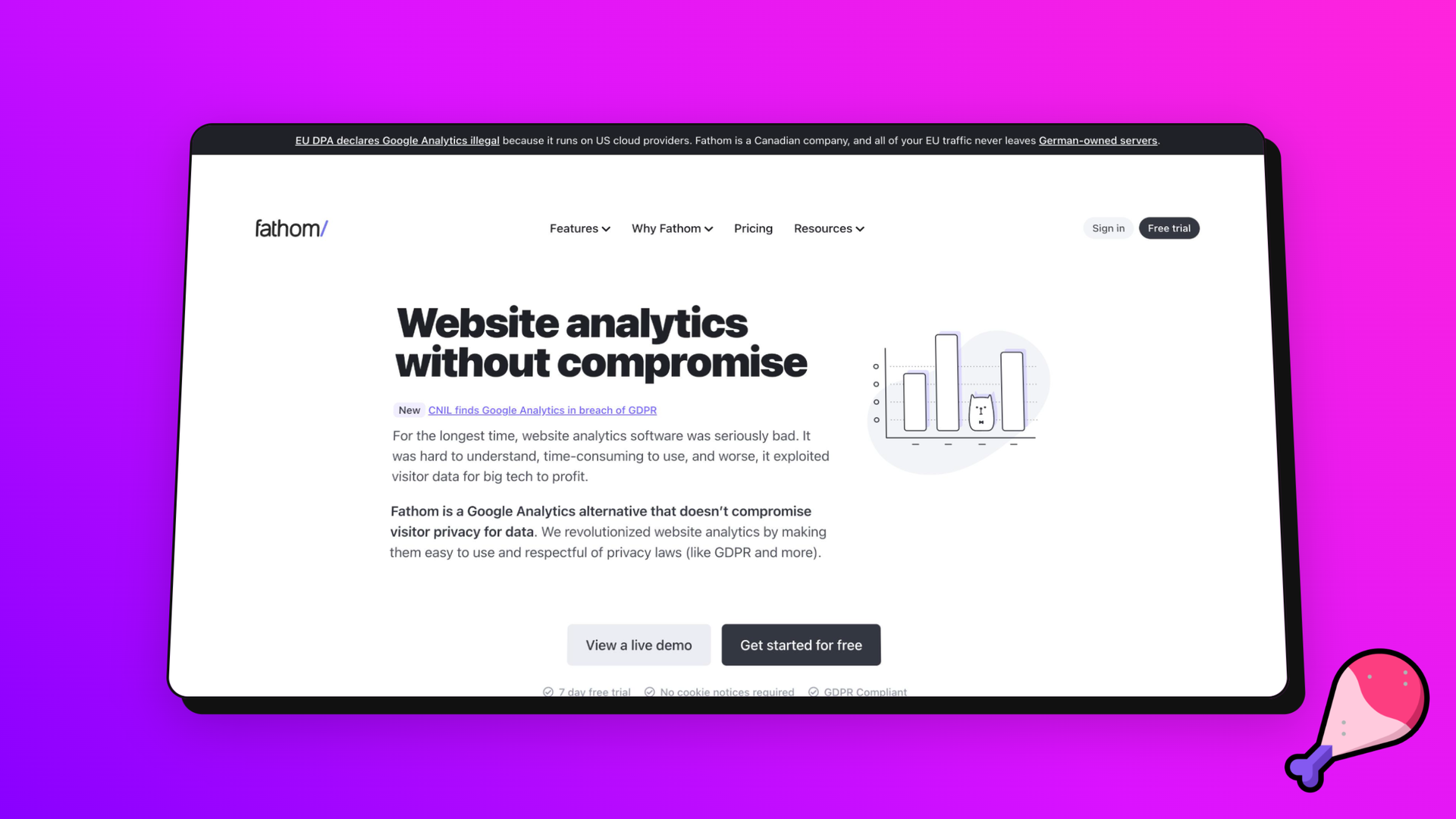
Fathom uses Hero copy to compare:
❌ the painful before (Using Google Analytics) "for the longest time...", para 1
✅ and easy after (using Fathom) "we revolutionized....", para 2
Example 3: Popwork
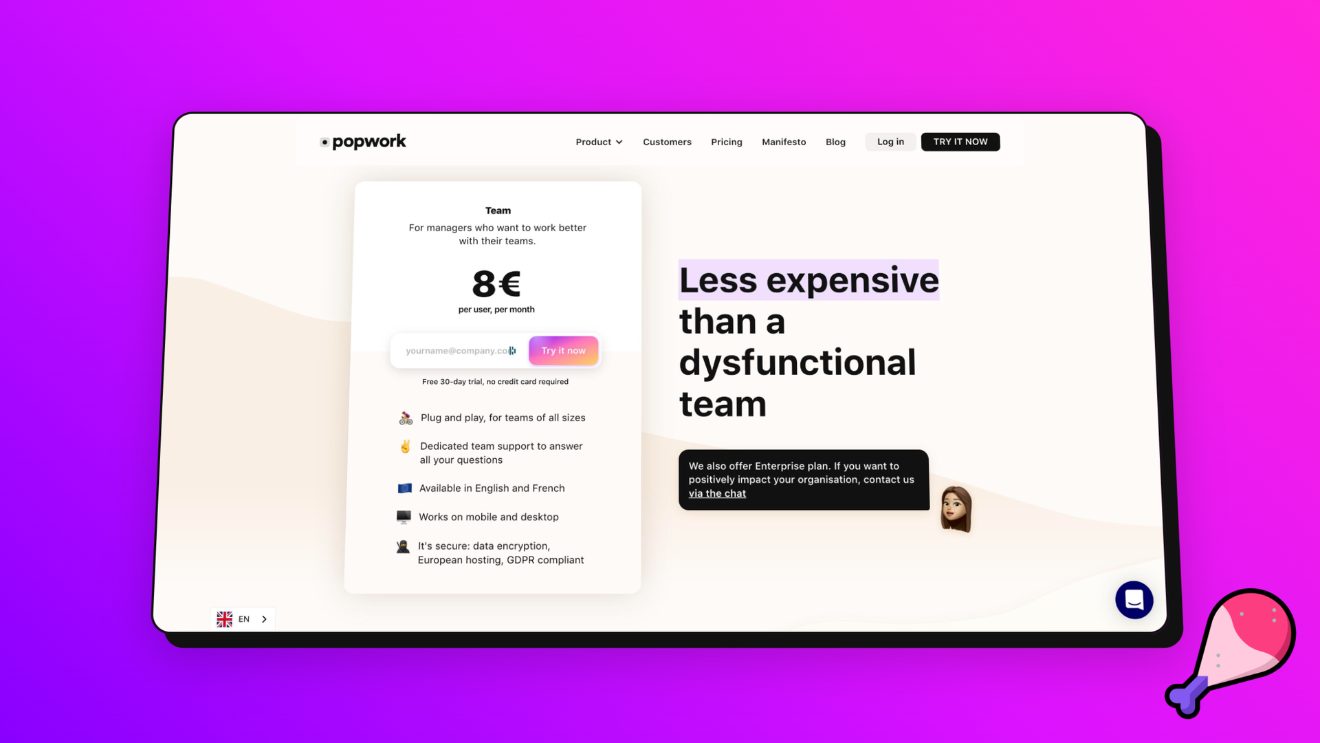
Popwork challenges the status quo with their Before And After. For 97% of landing page visitors the outcome is doing nothing.
Popwork compares signing up with inaction - keeping your dysfunctional team.
Example 4: Growth Mentor
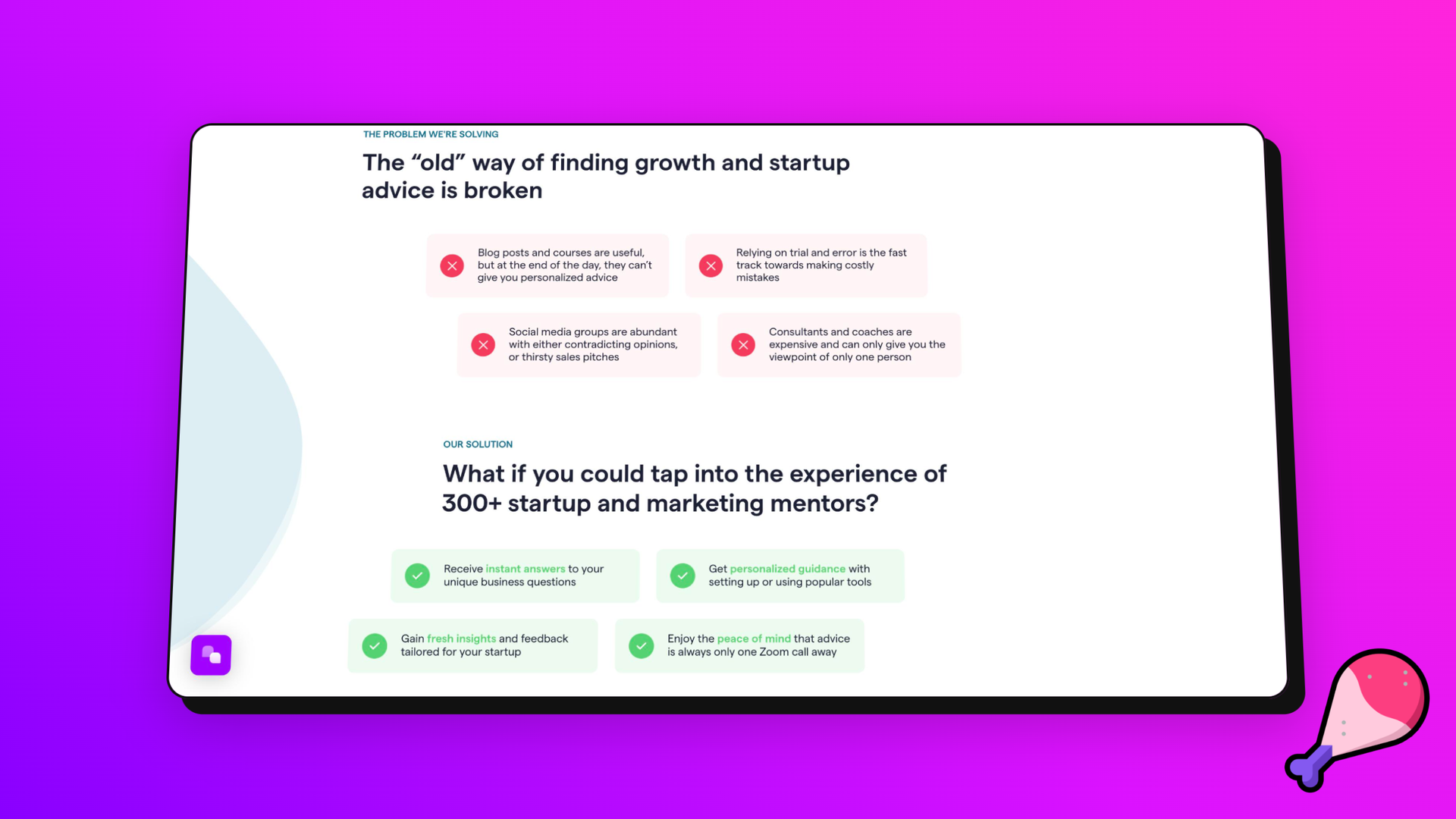
The "old" way is broken - here's our solution.
That's how Growth Mentor showcase the before and after on their landing page. They also split the before into 4 key areas and challenge each of the points with an 'after' counter-point.
Example 5: Basecamp
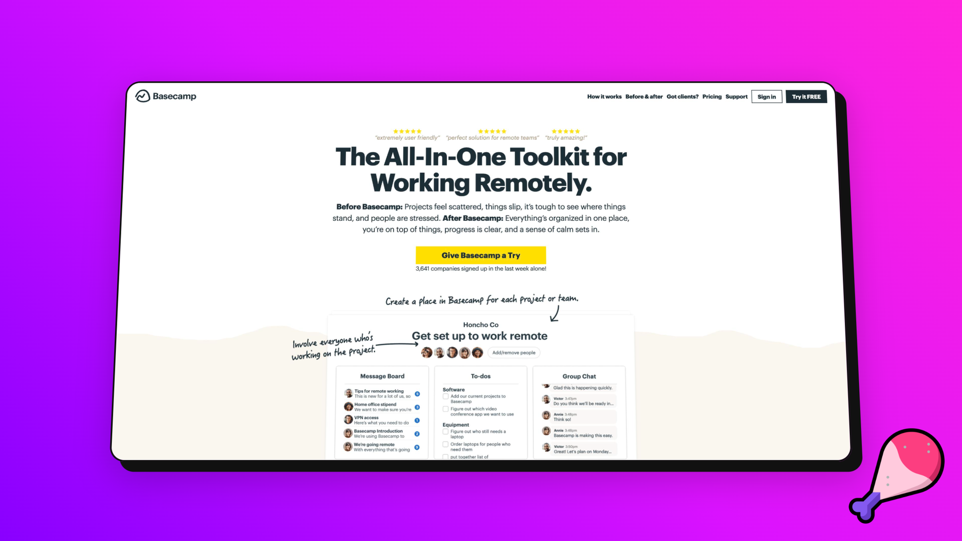
Use emotional and evocative language to capture the before and after, like Basecamp's literal execution (the Hero actually contains the words 'before' and 'after').
Basecamp drives high conversion with charged Hero language instead of long functional lists. See it here:
