7 *new* conversion rate tips for your SaaS landing page [2022]
![7 *new* conversion rate tips for your SaaS landing page [2022]](/content/images/size/w2000/2022/02/7-new-conversion-tips.png)
Get your landing page right and you can convert more first-time visitors into customers. Here’s 7 new tested techniques to get more leads from your SaaS landing page.
1. Embed your sign up form
A new landing page trend is to embed your sign up form directly into it. This means the user doesn't have to click and load a new page to sign up.
With this technique you can either redirect the user to a longer sign up form that's already populated with their email address, or send them a password-less login link over email.
You can see this new trend on several leading landing SaaS pages including Intercom's and Live Chat's.
A thread of the best SaaS landing pages 🧵
— Olly roastmylandingpage.com (@helloitsolly) September 6, 2021
And how they turn more visitors into customers.
1. @intercom
First sign up field embedded on the landing page. Automate a follow up email to those that drop their email but don't finish signing up. pic.twitter.com/oxVWnW0vhW
2. Understand why people aren't signing up - by asking
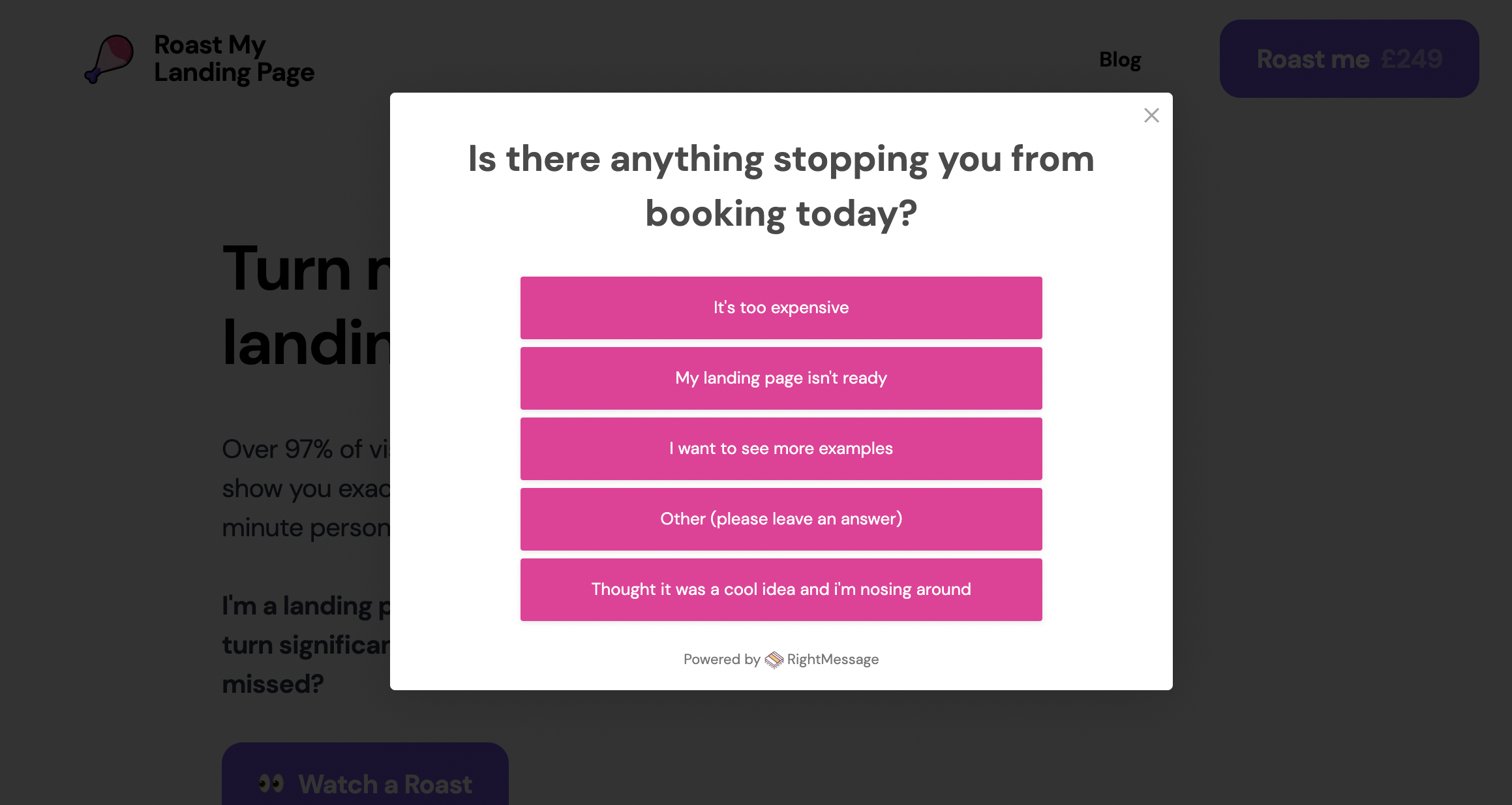
I've roasted over 500 landing pages and very few people have a clear understanding of why their landing page isn't converting, even if they have analytics in place. A simple exit intent survey can help you understand your visitors reasons for leaving.
Exit intent popups monitor a user’s mouse behaviour on desktop devices and trigger exactly when a visitor moves the mouse to the corner of a page to leave.
Use your exit intent survey to ask the visitor why they didn't sign up today to identify common objections ie reasons for leaving.
If you're not sure where to start, include a free form answer option, and review any emails, tweets or other inbound messages for questions from people learning about your product.
Tip! An alternate use of exit intent is to drive new email subscribers with a lead magnet or offer a discount.
3. Change your chat bot copy to double your replies
I recently doubled a client's landing page bot replies with a simple change. I was able to increase responses from 1% of visitors to 2% by changing the copy in the chat bot.
The original copy was passive, and simply told to the visitor to reach out if they have questions. The new copy was active - directly asking the visitor a question which they could easily answer, and therefore opening up a conversation.
I recently doubled a client's landing page chat bot replies in 60 seconds.
— Olly roastmylandingpage.com (@helloitsolly) August 27, 2021
Here's how. pic.twitter.com/9tmHwV7Gqo
4. Collect emails OFF your landing page
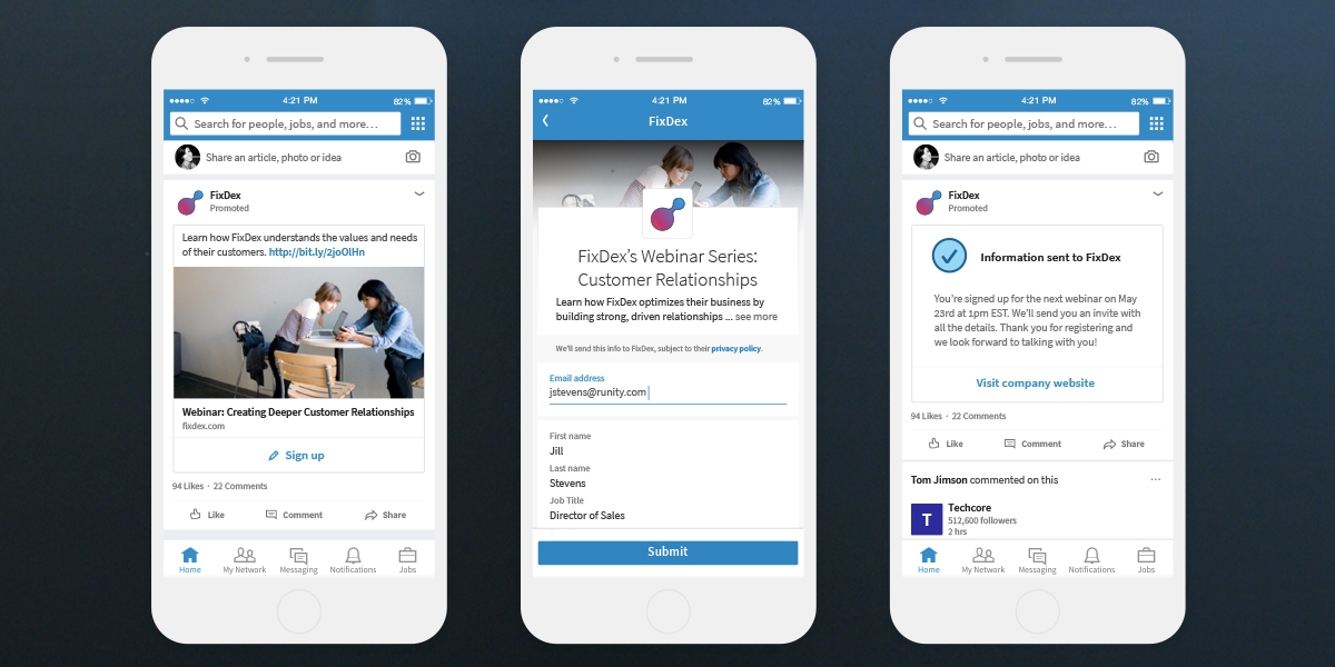
Both LinkedIn and Facebook have an ad format called Lead Ads. These creative formats allow you to collect email addresses and other information directly on their network, without the visitor clicking a link to your landing page. This may seem counter intuitive, but the cost per lead is often significantly less.
There is less friction for the user as they do not need to click and load a page, and the form is pre-populated with their data. This allows you to collect email leads at a more reasonable cost and then nurture them into signing up for your service.
5. Add benefits and social proof on your sign up page
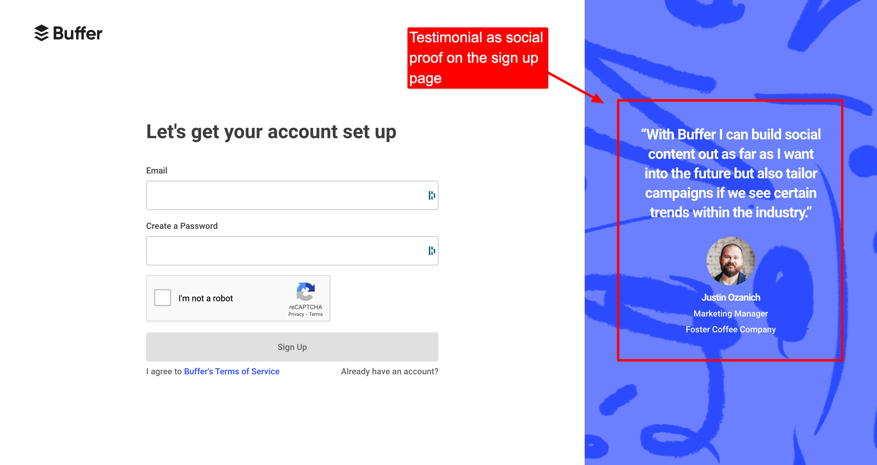
Your sign up process is a funnel not a single page. Your visitors traditionally visit your landing page and then go to a sign up page (or series of pages). These pages are critical to conversion as the visitor has already shown interest by loading them.
Regularly test and iterate on your sign up page(s) using the ideas that follow.
Changes to test on your sign up page
Consider:
- Restating your product benefits
- Adding social proof like:
- client logos
- testimonials [read my guide to landing page testimonials]
- awards
- Addressing common doubts like:
- how much does this cost?
- Is this easy to integrate?
- How long does setup take?
- Do I have to use a credit card?
6. Address people who aren't ready to sign up
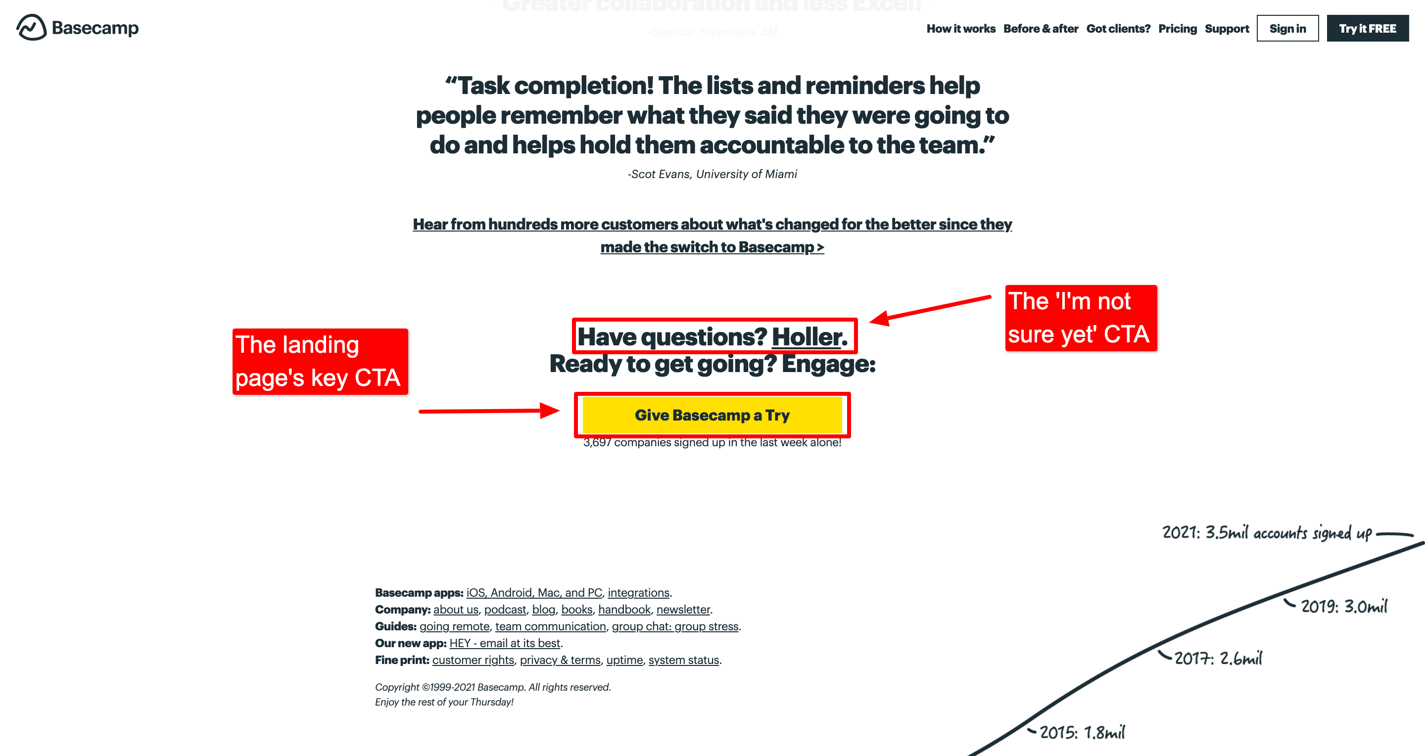
Although it's important to give your visitor clear and consistent CTAs to drive higher conversion, you need to acknowledge not everyone will be ready to sign up after reading your landing page.
Create a call to action for someone who wants to know more that acknowledges this state of mind. You can see this above on the Basecamp landing page: the critical CTA is a large, high-contrast button, but there is a secondary CTA to get in touch.
TIP! Another common CTA for this route is to push visitors into a demo. This is more work but is a great way to understand the doubts and questions your potential customers have - and then address them on your landing page.
7. Remove your landing page videos
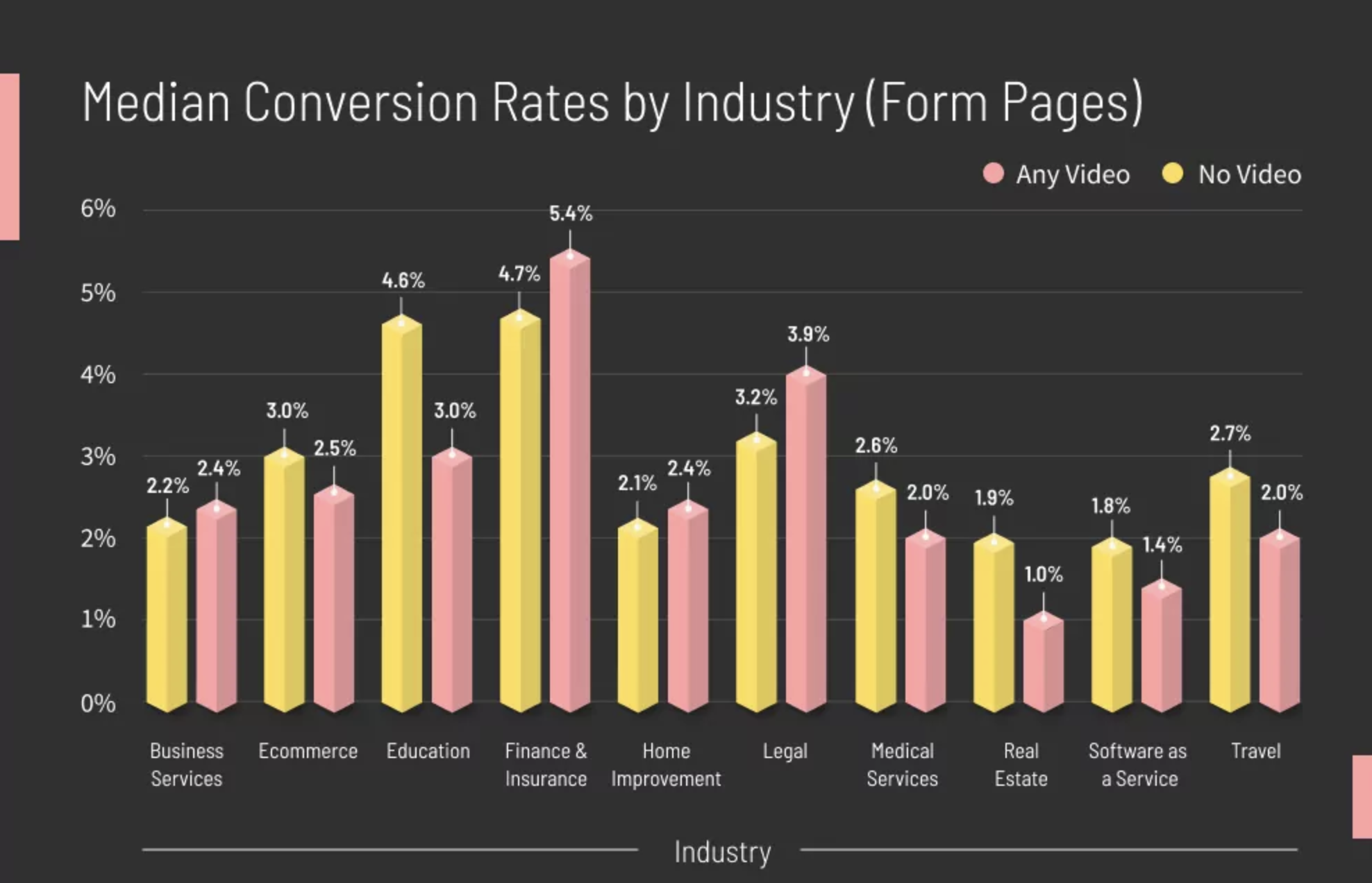
Yep! Really.
New research from Unbounce suggests that in most cases video actually decreases landing page conversion. Their comprehensive research is detailed here and makes for sobering reading - as common wisdom on landing page conversion has always been that video increases conversion.
Two things that might be at play here:
- Videos slow page load times. Page speed is a big factor in conversion
- Videos have really low play rates (5 - 15%). If you have critical information or messages in your video and visitors don't want the commitment of watching it, they'll miss these messages and leave.
What to do if you are using video on your landing page:
- Do not include critical information and messages exclusively in your landing page videos
- Review your video play rate and other performance metrics
- AB test your landing page with and without video to see how it impacts conversion for your audience
Your landing page conversion checklist
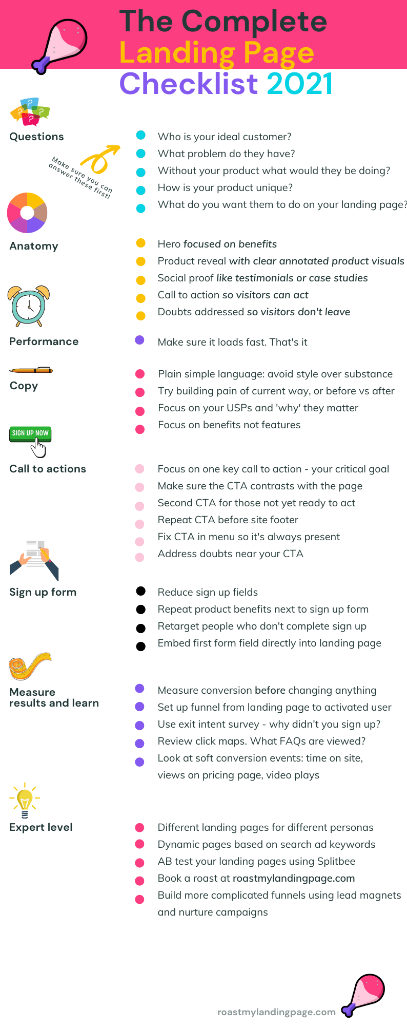
Reviewed the 7 new landing page conversion trends? Here's a comprehensive landing page checklist: make sure you've checked everything off before launching your next SaaS landing page.
