[ROAST] Bannerbear's $25,000 MRR landing page
![[ROAST] Bannerbear's $25,000 MRR landing page](/content/images/size/w2000/2022/07/headline-bannerbear.png)
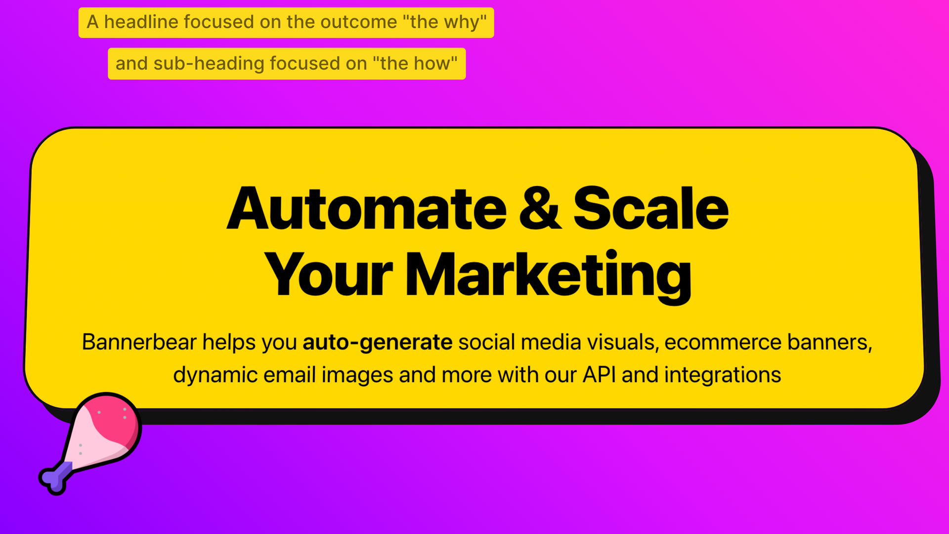
Bannerbear is now generating $30,000 monthly recurring revenue. A high-converting landing page is key to their success. Here's what you can learn from it. (Remember to review the page first here)
The benefits based headline
The Bannerbear headline focuses on the benefits. What you can achieve with the tool, the why it matters. The subheading is more focused on the function itself. Not everyone likes these abstract headlines but visitors connect with benefits over features. Plus, the use of 'you' speaks directly to the visitor.
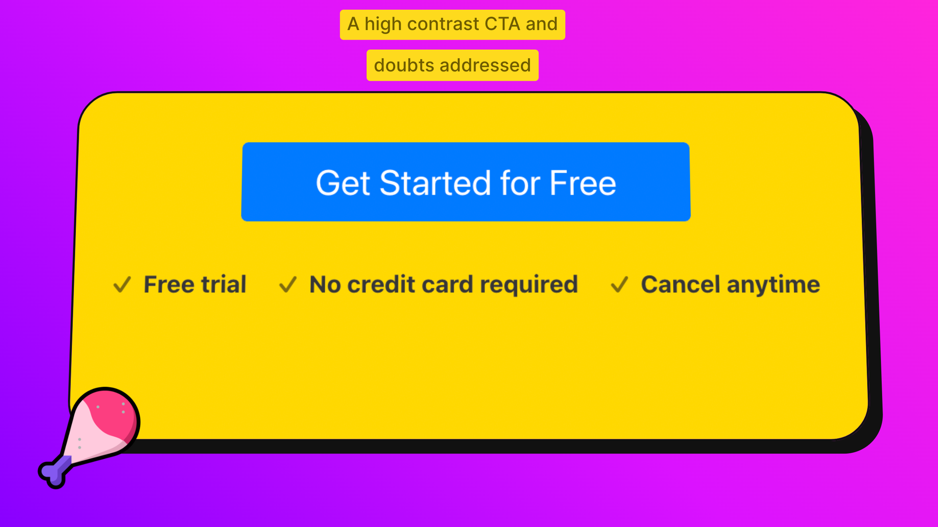
The CTA button and doubts addressed
High contrast CTAs are proven to increase conversion - this blue on yellow stands out. Visitors have doubts like "how much?" and "am I committed?". Doubts vary by persona but you should address them here, in your copy, or later in FAQS.
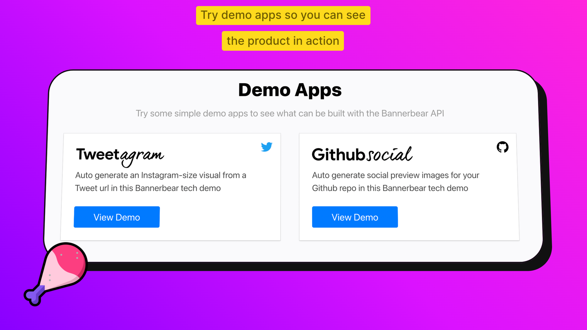
Product demos to play with
A common conversion phrase is show don't tell. That means instead of text descriptions you should use product shots, short animations and even product demos to showcase your product. These are not prodcut demos with sales reps, but interactive product demos embedded on your landing page. Like this.
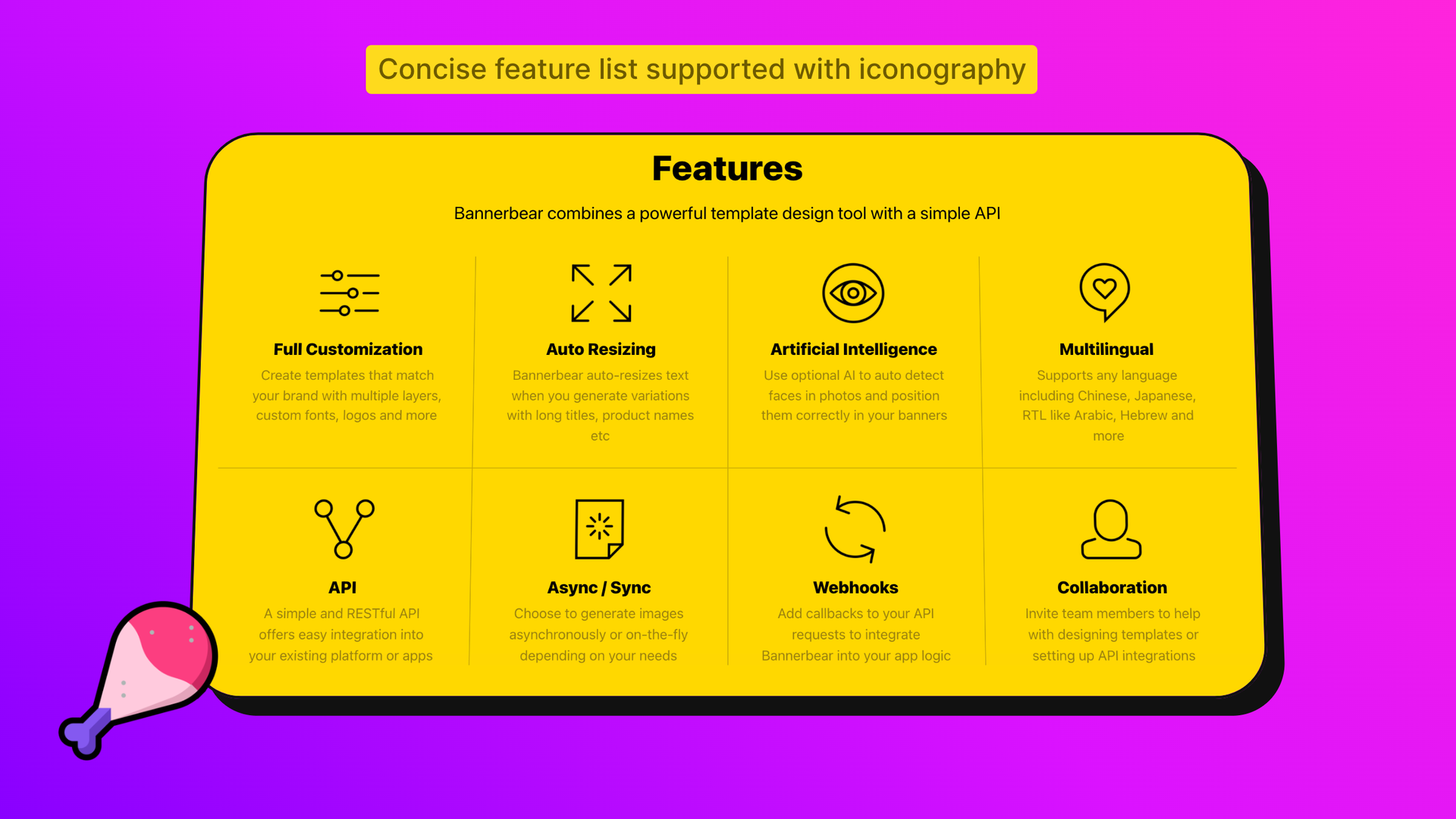
When showcasing features make them clear
At some point the visitor may want to see a full feature list - especially if they are in the comparison stage. Keep each feature description short, explain its purpose, and use icons to increase scan-ability.
Support with social proof
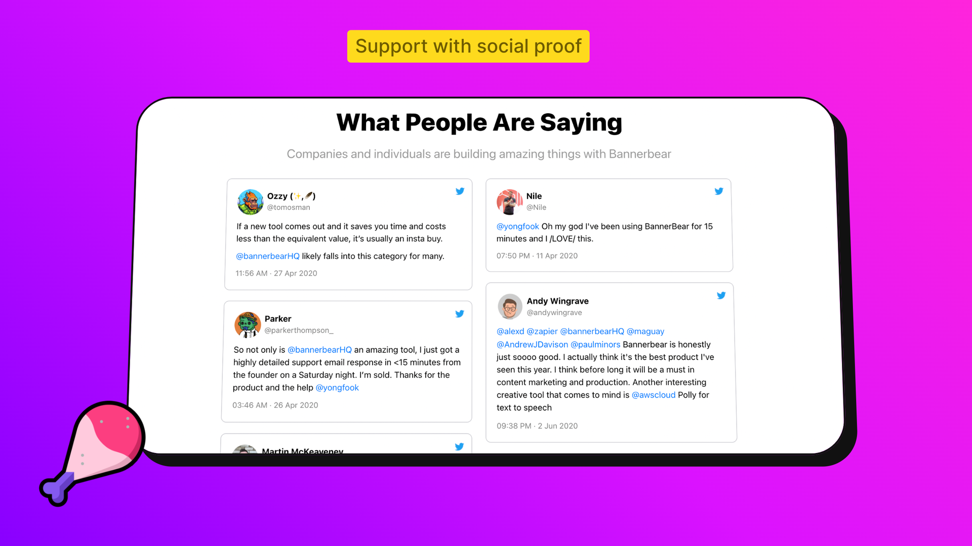
The best landing pages use social proof to increase conversion. That could be testimonials, awards, client logos or quantifications (x customers signed up this week).
Bannerbear embeds customer tweets which feel very natural and 100% authentic (because they haven't been asked for). Learn more about making great testimonials.
Bonus: marketing idea (build search footprint)
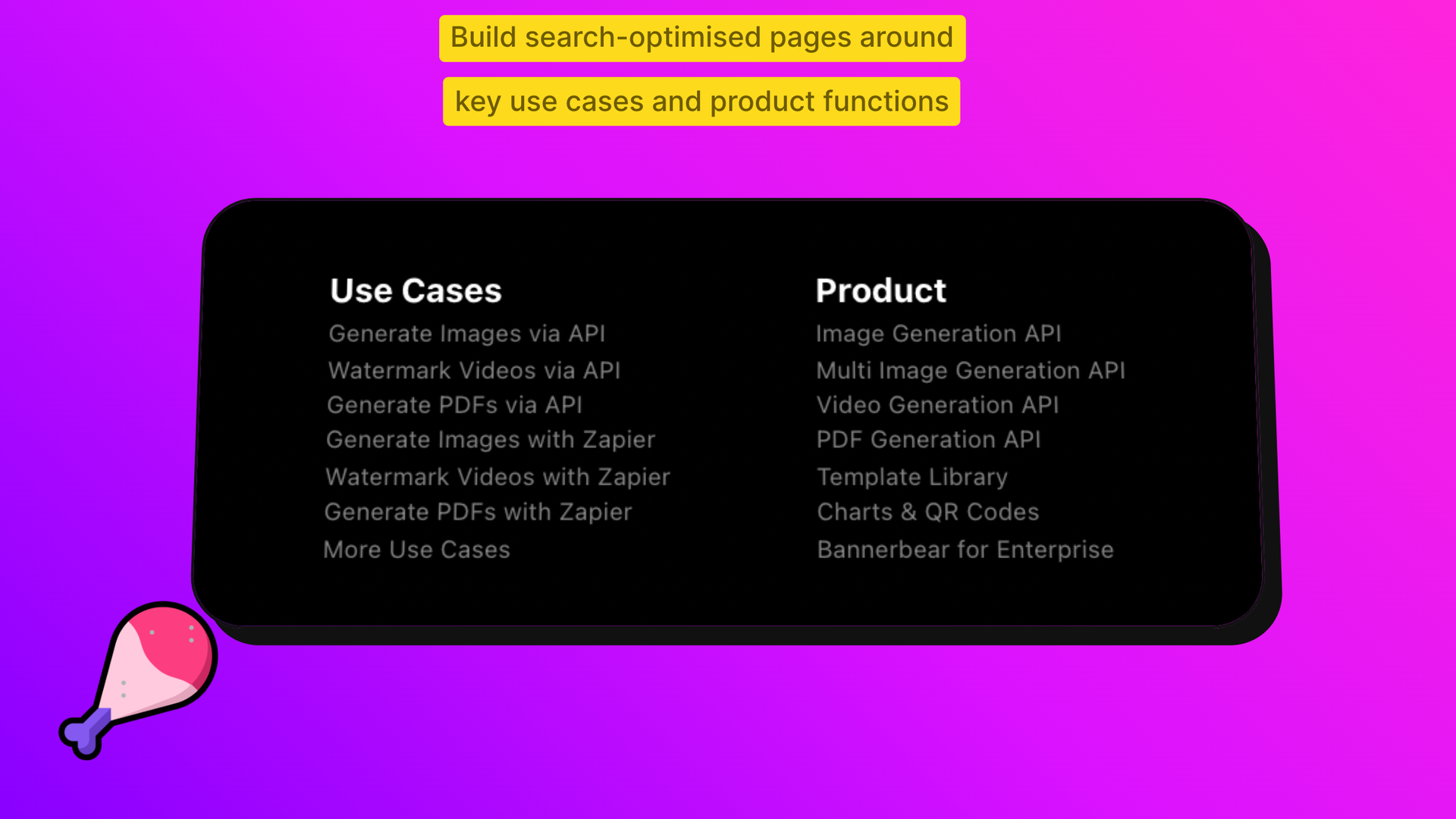
Bannerbear has created multiple search-optimised pages (like this) for key use cases and product features. Deconstruct key features in your product and build pages for them so you can be discovered in search engines.
