The anatomy of a high-converting landing page
View the anatomy of a high-converting landing page. Review the 6 critical elements your landing page needs.

Do you want to understand the anatomy of a high-converting landing page? I got you.
This post will show you the typical anatomy of a SaaS landing page, and details the sections, elements and why for each section.
It also includes a walk-through of a high-converting landing page, section by section.
About this visual
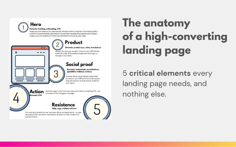
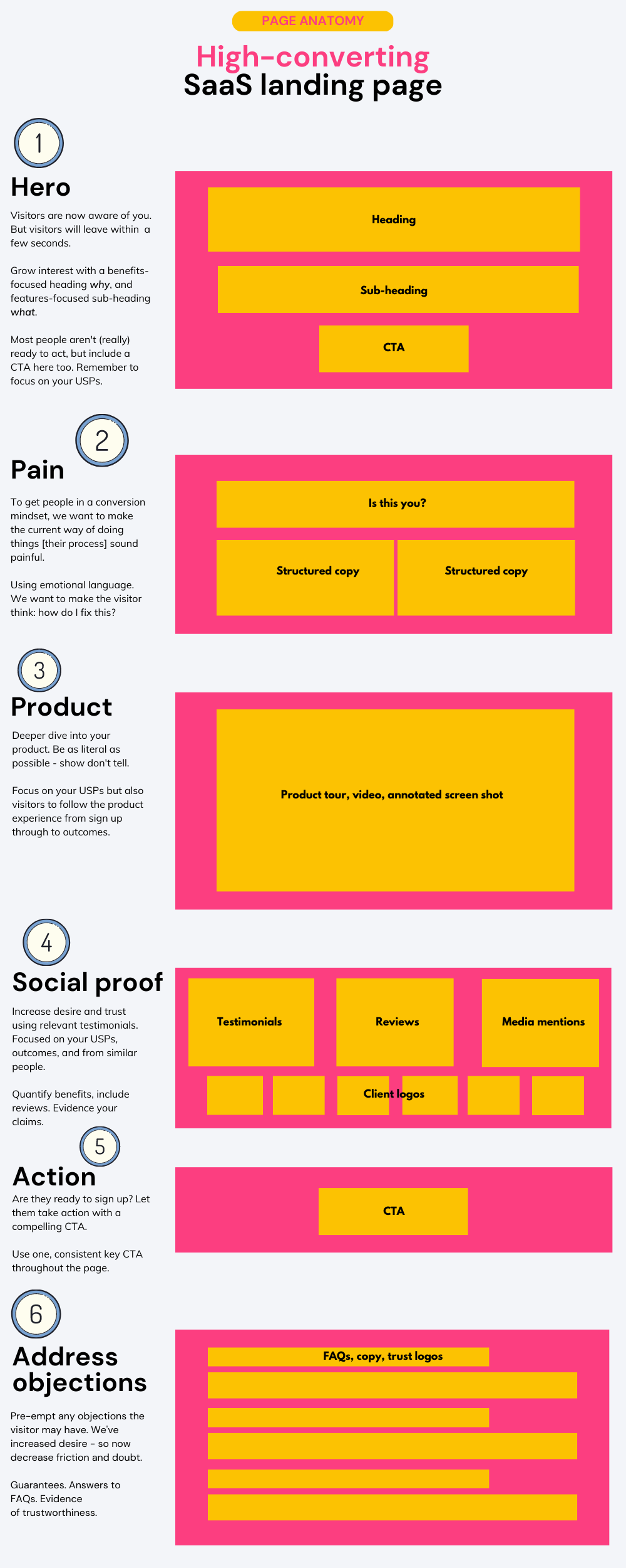
I introduce the section name, the elements the section is made up of, and why you need it on your landing page. Every SaaS landing page should start with these key sections.
The anatomy of a high-converting landing page
Anatomy explained
Section: Hero
Visitors are now aware of you. But visitors will leave within a few seconds. Grow interest with a benefits-focused heading why, and features-focused sub-heading what. Most people aren't (really) ready to act, but include a CTA here too. Remember to focus on your USPs
Section: Pain
To get people in a conversion mindset, we want to make the current way of doing things [their process] sound painful.
Using emotional language. We want to make the visitor think: how do I fix this?
Section: Product
Deeper dive into your product. Be as literal as possible - show don't tell. Focus on your USPs but also visitors to follow the product experience from sign up through to outcomes.
Section: Social proof
Increase desire and trust using relevant testimonials. Focused on your USPs, outcomes, and from similar people. Quantify benefits, include reviews. Evidence your claims.
Section: CTA (call to action)
Are they ready to sign up? Let them take action with a compelling CTA. Use one, consistent key CTA throughout the page.
Section: Address objections
Pre-empt any objections the visitor may have. We've increased desire - so now decrease friction and doubt. Guarantees. Answers to FAQs. Evidence of trustworthiness.
More on creating a high-converting landing page
Copywriting
- Pain: conversion copy: read about using PAS to drive conversion
- And review these 14 amazing examples of B2B copywriting.
Social proof
- Testimonials are great for social proof. Here's a testimonial teardown.
- Case Studies are also good social proof. Here's 3 examples of case studies.
- A great image can increase landing page conversion. Read: landing page images.
Popwork's landing page anatomy
I reviewed 200 SaaS landing pages in the last 12 months 👀💪
— Olly roastmylandingpage.com (@helloitsolly) May 11, 2021
The best was @popdotwork. Here's why 🧵
1️⃣ Benefits focus in the Hero section: pic.twitter.com/BliOlD3nFH