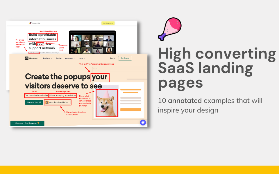
High converting landing pages: 8 annotated examples
8 examples of high-converting SaaS landing pages annotated with the unique things they are doing to increase conversion.

Examples of high converting SaaS landing pages.
Here's 8 examples of high-converting SaaS landing pages annotated with the unique things they are doing to increase conversion.
For this post I've focused on deconstructing the landing page Hero sections of leading SaaS companies, rather than the complete landing page. Most landing page Heros are a contracted version of the full page. They have an image, headline, subheading and CTA, and usually detail problem, solution and benefits.
What is a high converting landing page?
A high-converting landing page is a website page focused on conversion that turns more than 5% of visitors into sign ups or enquiries. You can read more about high-converting landing pages here.
You may also want to see examples of request a demo pages.
High converting landing page examples
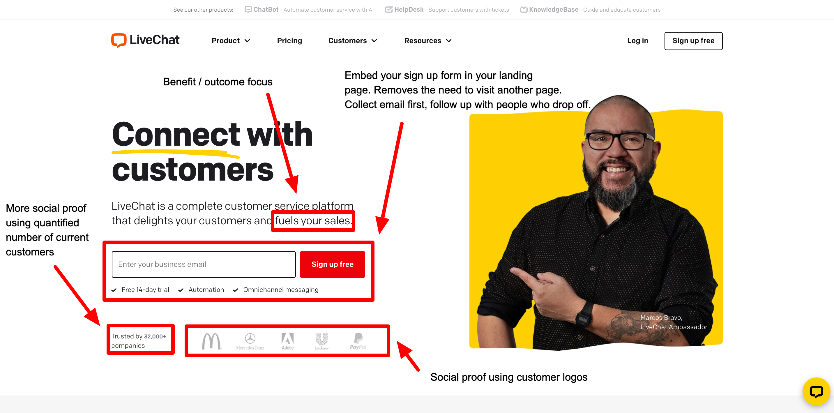
LiveChat's landing page - embed your sign up
LiveChat loads the sign up form directly in the landing page, reducing the number of clicks required to convert. They also have strong social proof, using both customer logos, and the quantified number of current customers.
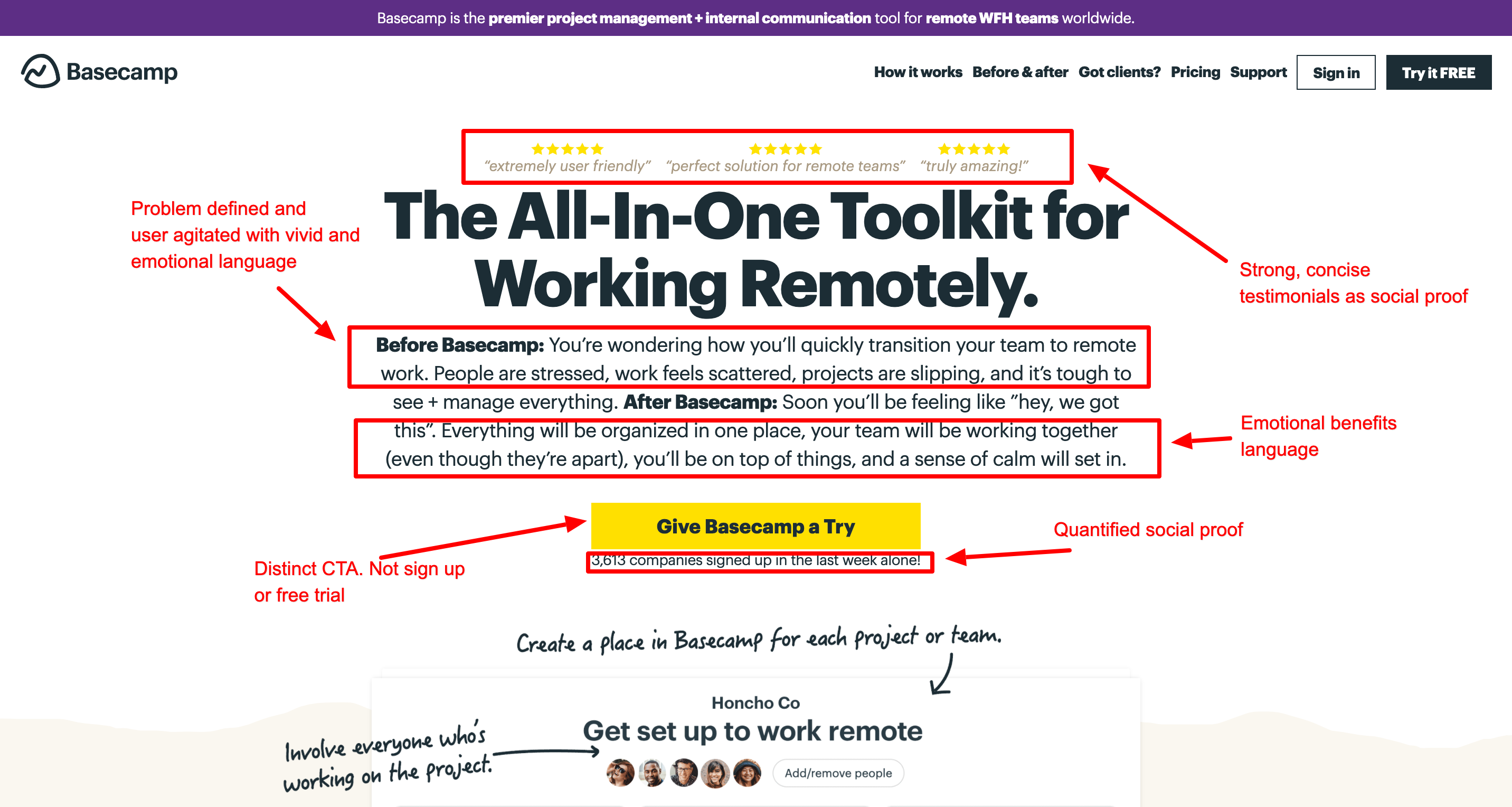
Basecamp's landing page - agitate the visitor
Basecamp's landing page is a great example a high converting landing page. However one critical thing it does is agitate the visitor. It doesn't just describe the problem, but uses emotional and vivid language to increase to intensity of it. This increases the user's desire to find a solution to the problem.
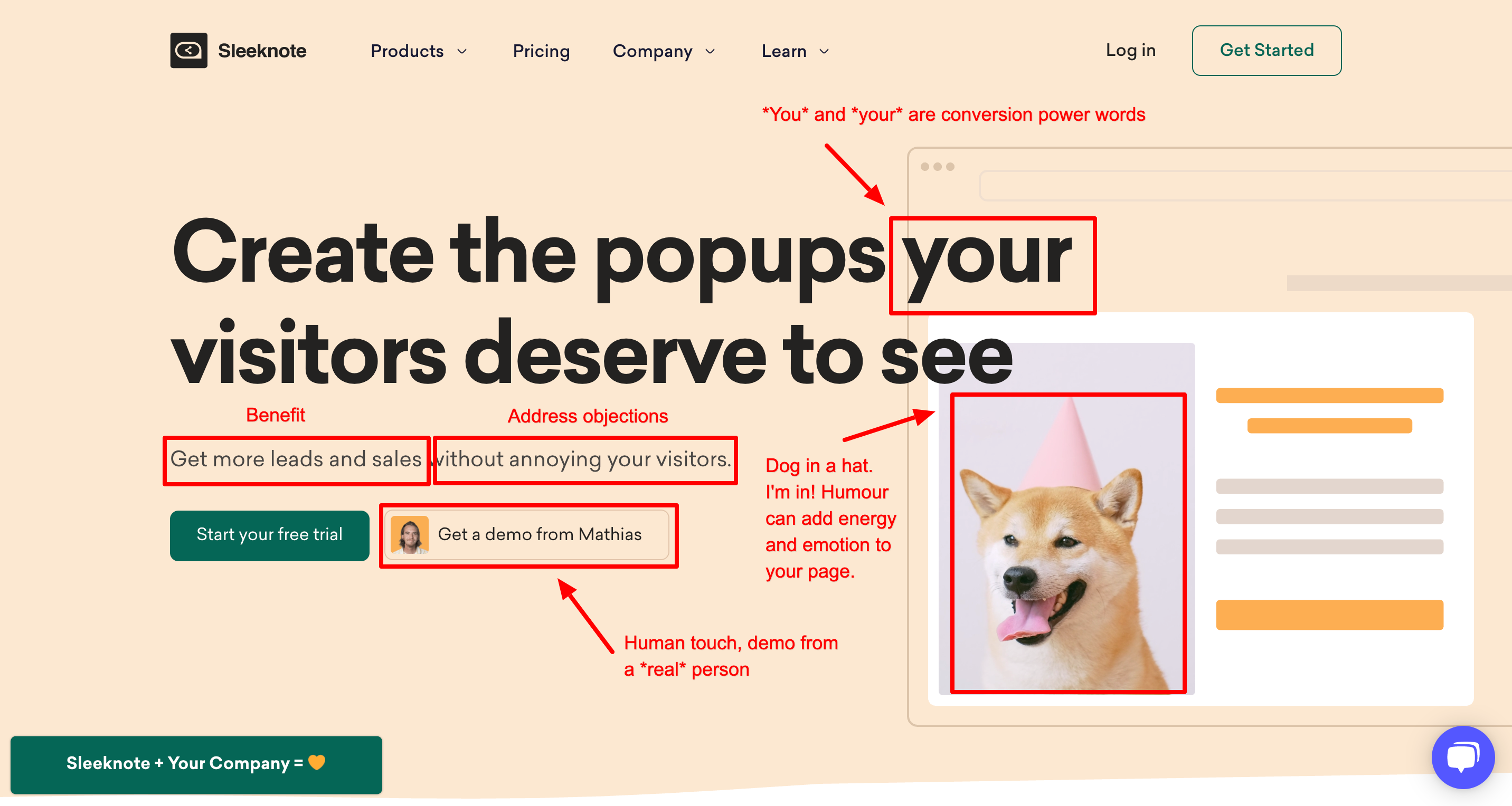
Sleeknote's landing page - personalise and add humour
Want to be more memorable? Personalise your page. Sleeknote does two great things here. When you book a demo, it's with Mathias, a real human, not a nameless drone.
And an animated dog wearing a hat as the key landing page illustration is the type of humour and lightness that the modern B2B customer expects from their SaaS provider.
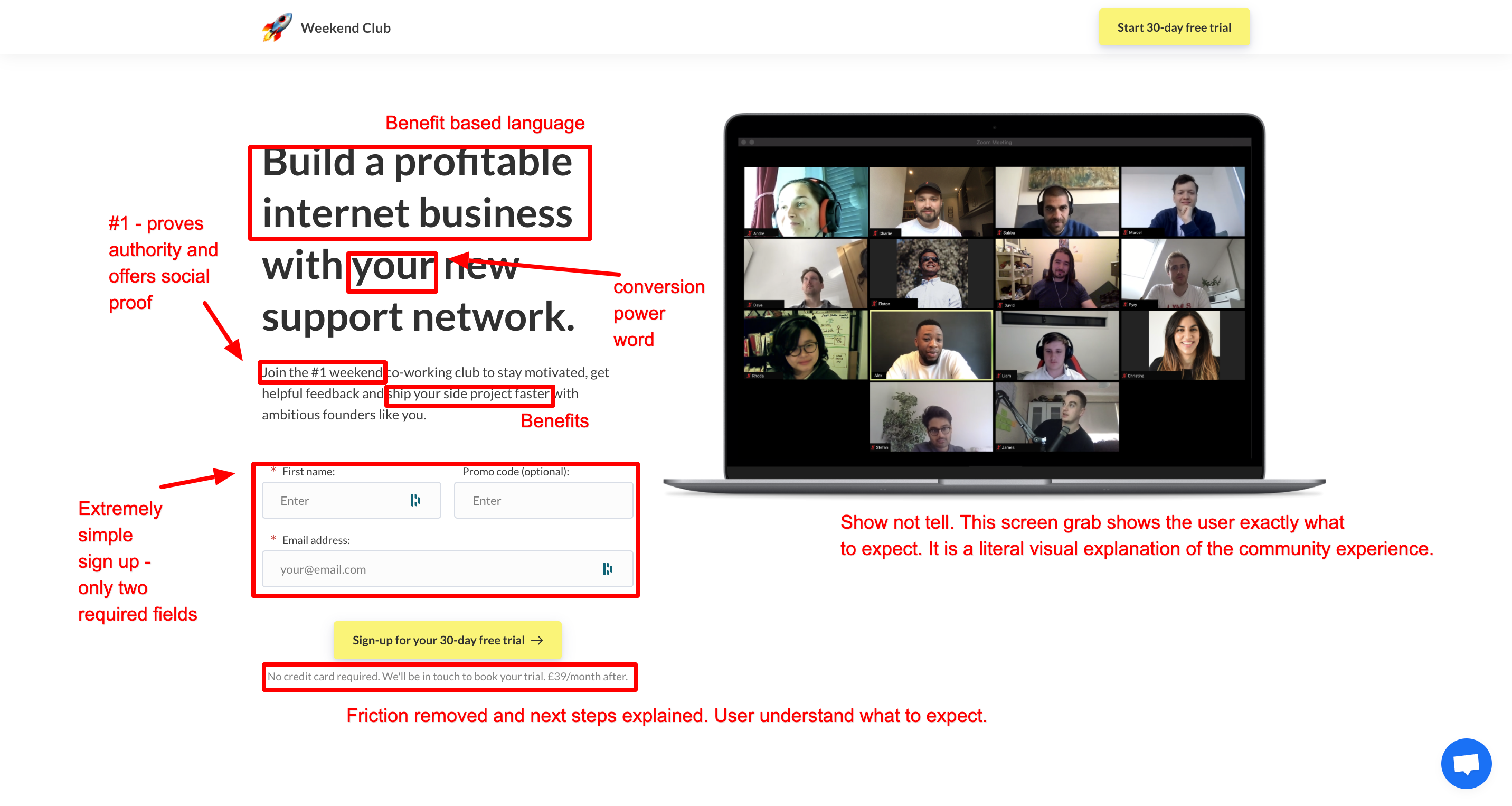
Weekend Club's landing page - show don't tell
A great landing page image is extremely powerful. It can relay unique startup concepts in a clear and easily-understood way. On Weekend Club's landing page, the idea of weekly remote co-working is clearly demonstrated with a screengrab from the Zoom call. My only suggestion would be to add the project logos against each person attending.
Weekend Club's landing page also focuses on benefits, proves authority with its #1 claim, and uses an extremely simple two-fields-required sign up form.
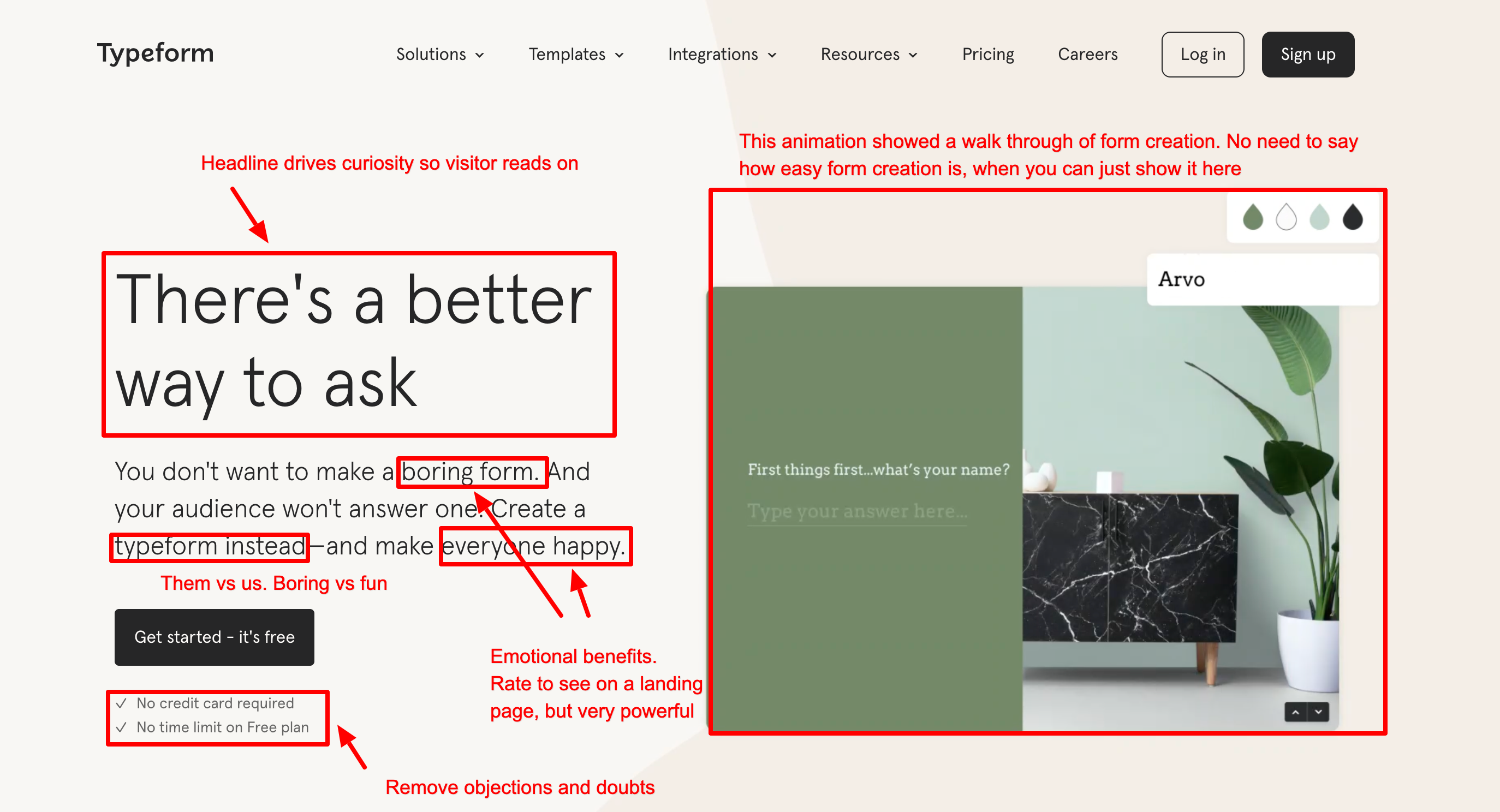
Typeform's landing page - us vs them
Typeform tell you how it is. Other form tools are boring. Theirs will make you and your visitors happy.Their form builder is also really simple - which they don't need to tell you, as their landing page animation shows you. So, do you want to use a boring form builder, or a Typeform?
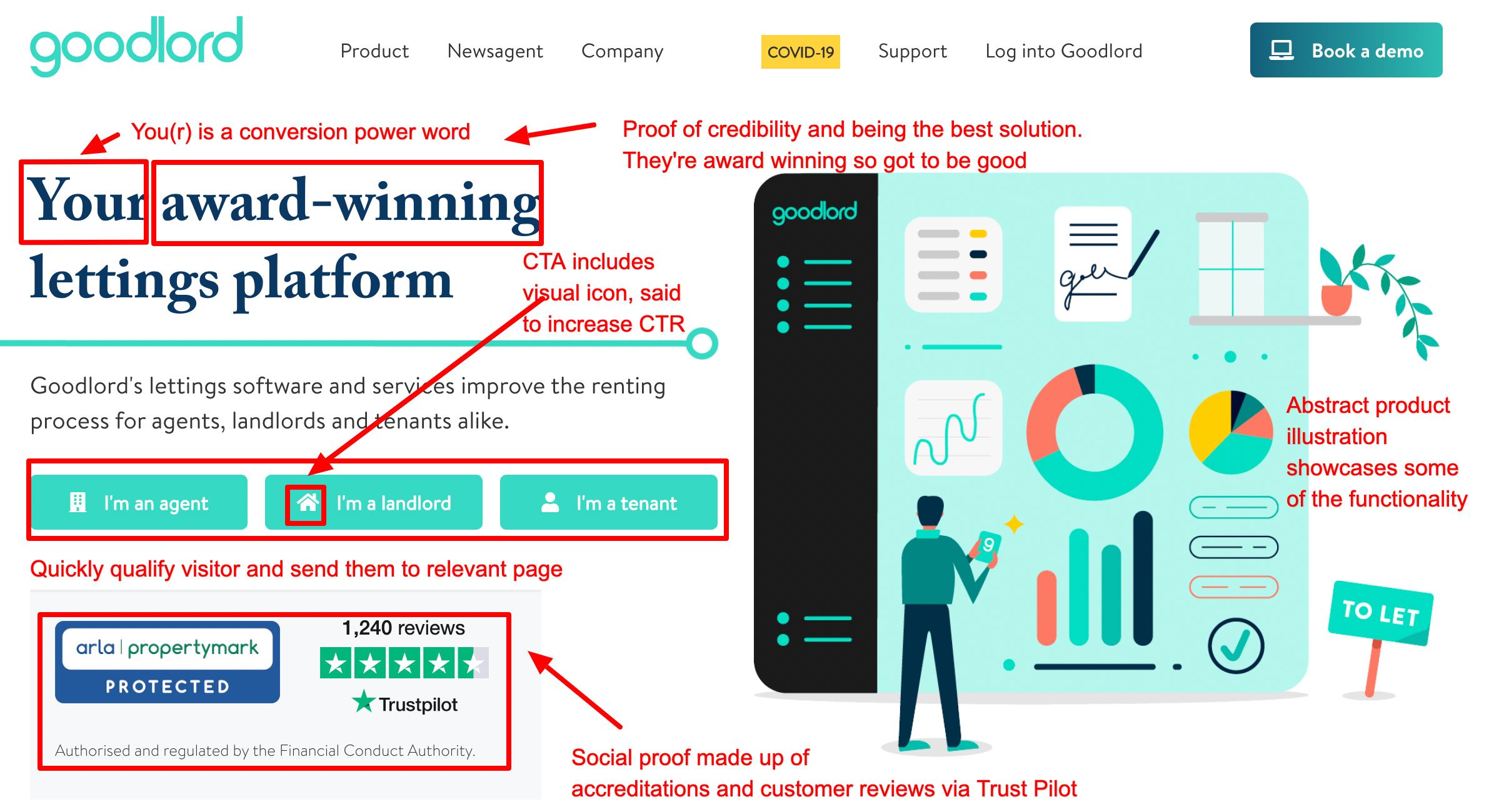
Goodlord - qualify the visitor
Goodlord have many potential buyers which is why their landing page qualifies the visitor and sends them to relevant information a quickly as possible. They also use 'award-winning', accreditations and customer reviews to build credibility and social proof. There is some evidence that image and emojis in CTAs drives an increase in click through rate - you can consider testing this on your own landing page.
Wise - make bold claims, if you can back them up
Wise claim to be cheap and fast. I'd normally advise you to steer away from this types of claim, but Wise can back it up. With stats, a calculator and over 10,000,000 customers.
The embedded calculator is pre-populated so the visitor doesn't have to do anything, but they can opt to quickly input their own data to understand the savings they can make.
Finally, startups in the finance space (and anyone handling visitors' money) need to remove doubt by proving their trustworthiness, which is why accreditations need to be showcased. [not b2b]
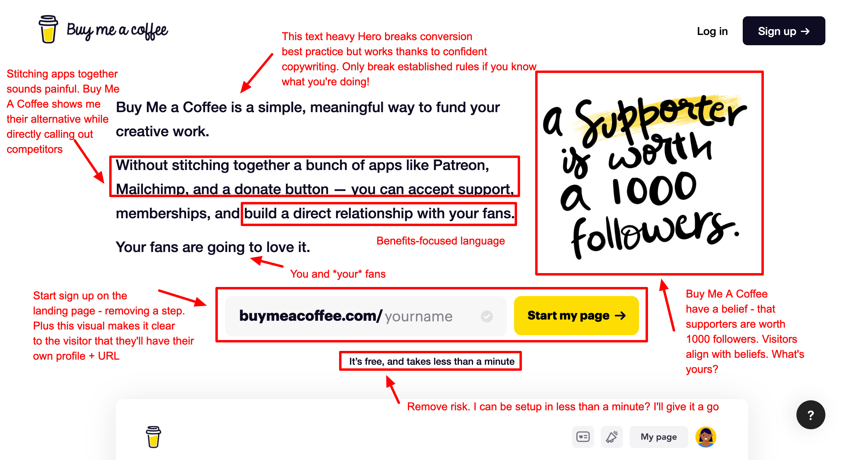
Buy Me A Coffee - break rules, if you know what you're doing
The Buy Me A Coffee landing page breaks established conversion best practice by placing a large block of text in the Hero space. Confident copywriting and great visual execution allow them to try something different.
Their bold statement of a supporter being worth 1,000 followers is thought provoking. It allows the visitor to reflect, subscribe to that belief if they agree, and ultimately sign up.
You can read my complete guide to SaaS landing page conversion.