9 interesting ways to optimise your mobile conversion rate
Conversion optimisation on mobile is slightly different than on desktop. Here are 9 ways to increase your conversion rate on mobile.


Want to get highly-targeted customers for less money?
One of the best ways to increase your return on marketing spend or time is to work on your website’s mobile conversion rate optimisation.
This practice is often misunderstood as a tiny subset of CRO and often overlooked but, in reality, it represents about a half of total visitors to your website’s landing pages, meaning you are losing on real business if you don't apply it.
Before I dive into the details and some hacks to lower your customer acquisition costs, let’s look at what mobile CRO is.
The value of mobile CRO as a business practice

Mobile conversion rate optimisation improves your lead generation strategy specifically for mobile devices, increasing the number of visitors who convert into qualified leads when using their smartphones and tablets.
Why differentiate between mobile and desktop
It’s a brilliant question. Whatever business you’re in, either B2B or B2C, most of your prospective customers start their search on a mobile device.
According to Statcounter (as of July 2021), the share gap between mobile vs desktop searches is still increasing in favor of mobile:
- Mobile; 58.5%
- Desktop: 41.5%
This isn’t just a one-off. The gap between the number of people using mobile to search for products and services, as opposed to desktop, is increasing every year.
This means that investing in mobile conversion optimisation is critical to any digital marketing strategy, especially for long-term SEO strategies.
Apart from the share gap, mobile devices are particularly tricky to optimise for because of their portrait view compared to traditional landscape...
Optimising conversions for portrait devices
An important thing to mention before I take you through some mobile CRO best practices is that device orientation is important.
Site pages look very different between mobile and desktop, and they also change if you’re looking at them in portrait or landscape on mobile.
As 90%+ of people mainly view their mobile devices in portrait, it’s important to always make this the default view for optimisation purposes.
9 Ways To Increase Your Mobile Conversion Rate
Although you'll want to walk in your ideal customers' shoes before you make any changes to your website—mobile or desktop—I've identified 9 hard truths about optimising mobile user experiences for conversions:
Method #1: Increase/Decrease Font Sizes
It’s essential to make sure that the font size of your content doesn’t push important elements off of the screen that loads first on your mobile website design (also referred to as "above the fold" section or "hero" section).
For example, a “Buy Now” Button shouldn’t disappear off the mobile’s screen because it’s been pushed out of the way because of the font size.
A couple of techniques to help avoid this is to use media queries that will change the size of your fonts to fit the screen of the person reading.
Also, making the site responsive to mobile devices is critical.
That means not just presenting a scaled-down version of the page but ensuring that the right-sized fonts are used throughout each section.
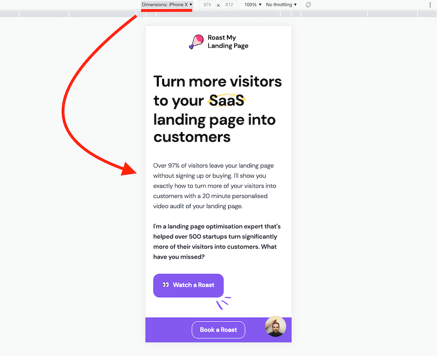
Method #2: Justify or Left-Align Your Call To Actions
Whatever the page, your most important visuals and text must be the most eye-catching. Without exception, that’s always your Call To Action, (CTAs).
How many people are you losing If they miss your CTAs? Fixing this issue is key to any mobile conversion optimisation strategy.

If you look at any eye-tracking studies, you’ll see that in most Western countries your eye is conditioned to read left to right.
This is probably why, according to the Nielsen Group, you mainly browse a screen in an F-shaped pattern. So when looking at mobile conversion optimisation for your CTAs, there are a few things to consider...
Put yourself in the reader’s shoes as they scroll down a page:
- Make sure your call to action elements or buy buttons don't get hidden off to the sides. That means justifying left or better still having them justified across the screen so they occupy more screen estate.
- Give directional clues to your CTAs either from the top or bottom. For example, a picture on top with a person looking right at the CTA centered on the screen draws the reader’s attention to it.
- Clear the view of any clutter. Although it may seem like "empty" at first, white space is a great thing to increase focus on specific CTAs.
These are 3 small things you can do to improve how a visitor perceives your call-to-action as soon as they land on your mobile website.
Method #3: Ensure Your Website Loads Fast
Of all the mobile conversion optimisation techniques, this is one of the most important to consider. The speed of your site is not only a big factor that Google’s algorithm considers in ranking your site, but also a significant performance booster from a lead conversion standpoint.
The speed of your mobile pages’ loading is determined by your site’s server, quality and consistency of code, and how static files (images, HTML and CSS files, and direct downloads) are served.
The speed of your site is a big factor that Google’s algorithm considers in ranking your site, but also a lead generation booster.
Depending on your hosting and development capabilities, you may want to address a web developer to increase your website load speeds.
Keep the following in mind for great results:
- Google has recently introduced a "Core Web Vitals" update which is all about combining speed with great user experience. You'll want to take care of these metrics before anything else for website performance.
- More than 50% of visitors are demonstrated to leave a website if it doesn't load within 3 seconds. That's about as much time as you have to have your landing page appear or you risk losing everyone involved.
Your website doesn't have to nail a perfect score on Google PageSpeed to achieve a good result nor does it have to be built with the most modern and up to date technologies, but it does need to be fast and usable.
Method #4: Swap Columns Where Appropriate
Columns that look great on a desktop page don't look as great on mobile.
When you scroll, you may find that the columns are in the wrong order or have lost their formatting compared to the desktop version.

When designing your page, it’s important to check the grid structure and if it’s suitable to serve up a different column order for your mobile pages.
Don’t simply rely on it automatically being responsive.
If you are using a market-leading theme such as Elementor or XPro (WordPress), the tools to do this are usually standard features.
Method #5: “Hide” Feature Sections In Drop-downs
A great way to save space and make a mobile page sleeker is to categorise and put pages and content sections into drop-down menus.
This looks a lot cleaner than having them as blocks of text on a mobile page.
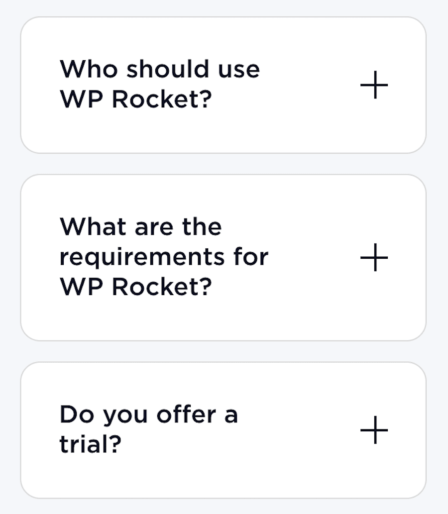
For example, you can organise all your blog categories or all of your services into title dropdowns which reveal more information when you tap on them.
The same goes for Frequently Asked Questions on a pricing page which is a very common pattern across Software-as-a-Service (SaaS) companies.
Method #6: Reduce (or Hide) Your Navigation Options
Another thing that any good theme will help you with is to reduce or hide navigation options on specific pages for optimised conversions.
For some pages—such as a landing or sales pages—you only want to show what your prospect needs to help them with their buying decision.

For example, on your home page, you may have menus that cover About Us, Portfolio, Blog, etc. These are irrelevant to a sales page. It’s important for a mobile page not to show them and only serve up what’s relevant.
Talk to your web designer or conversion rate optimisation specialist to make sure you have the right mobile conversion optimisation tactics in place.
Method #7: Fix Your CTA To The Bottom Of The Viewport
In responsive web design, the Viewport is what a reader can actually see when looking at a page. It changes depending on the screen.
So what you can see using a mobile differs from a tablet.
As I mentioned earlier, the CTA is the most important thing on your page as it allows the visitor to easily access the next step in your sales process.
When looking at mobile conversion optimisation, a strong conversion method is to set your mobile viewport so that your CTA is anchored at the bottom of the page and can’t be missed by the reader even as they scroll.

Method #8: Keep Footer Links Down To A Minimum
There is nothing worse than scrolling down a mobile page and suddenly coming across lists of menu items from the footer. It may look good on a desktop, but it certainly does not when you use a mobile.
Adding dozens of links to the footer of your home page is an outdated SEO technique; only add those that truly matter!
Not only does it make the whole page unreadable; it just looks messy, turns the reader off, and seriously affects mobile conversion optimisation.
Why do designers do this?
It's mostly an outdated SEO technique.
The belief is that, by listing all links in the root directory (i.e. the home page), Google will boost your rankings as they will understand the structure of your website better (search engines understand context via links).
Although this helped in the past, modern search engines use sitemaps to understand the full context of your website. So, listing all the website's links in the footer is not only not necessary but really distracting and confusing.
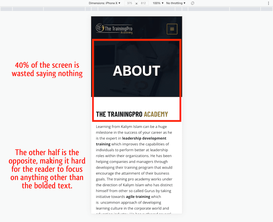
Method #9: Avoid Adding Too Many Sections
Adding too many sections to your home page can significantly affect the user experience. The more you have, the more washed out the message.
You may have a lot of explaining you want to do, but generally it's best to keep a mobile page about 7-9 full mobile scrolls in length.
(Unless you can build something as engaging as TikTok's feed!)
Don't try to cram too much stuff into one page; use the home page as an umbrella view for all key benefits you offer and dedicated landing pages for individual services and/or products you want to promote.
Originally published Sep 28 2021
Frequently Asked Questions
What is a good mobile conversion rate?
According to a study by Growcode, smartphone conversions in 2020 were on average about 2.92%. Anything above this is an excellent target to aim for.
Why are mobile conversions so low?
Mobile conversions are low because people on mobile devices usually show lower action intent, especially from a business perspective. It's not as easy to use a mobile device for work as it is to use a desktop device or laptop.